My sister’s house was painted 50 shades of light blue when they bought it, and it wasn’t sexy at all. All the rooms, the bathrooms, the study, the closets, etc., except the main entrance, had different subtle shades of the same light blue shade. Clearly, the last owner suffered from «whole house paint paralysis» and only went with the «one and done» approach. I get it: Choosing 11 different paint colours at the same time is challenging, it’s daunting, and it’s a lot at once, especially in the midst of all the other decisions you’re probably making.
In a perfect world, you paint one room at a time and see how it looks and feels before moving on to the next. But whether you’re repainting one room to work with the rest of your house already painted or have to choose all of them at once, there are things to keep in mind. There is knowledge for those who have done this before, which can help you do what we all want in life: mitigate regret and optimize the happiness of our home.
Do: Ask yourself some important questions about the big picture
I don’t want to be too existential, but if the design of your home is mostly about your personal preferences, about how YOU live, then you need to seriously consider the answers to these questions before choosing paint lightly.
How do you want to feel when you’re in the room? I know I look like a broken record, but it’s super important that you let the feel of the room dictate what it looks like, not the other way around. Do you want to feel cozy? Feel comfortable? Or feel like partying?
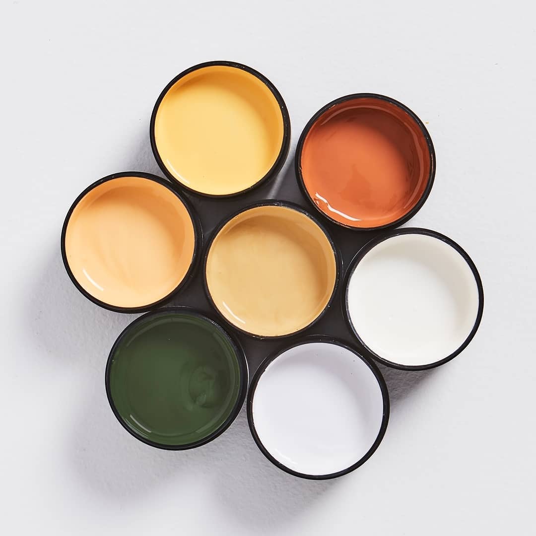
Do you want all the colours in the house to work together or do you prefer to have different exciting experiences in each room? The level of overall colour cohesion is absolutely a personal preference and really comes down to what you can stand. I like open spaces to have a common vibe and colour palette, but if rooms are separated from each other by doors, then you have more freedom to create different colour experiences.
What are your true comfort colours? The ones that always make you happy. Choose your comfort colours for the main spaces (take a risk in the less busy rooms). Although paint is easier to replace than wallpaper, it’s also good to get into the habit (which I’ve had to break) of not «buying something you could return,» even if it’s a coat of paint. If you have never opted for a lavender-coloured scarf in your life, then be wary that you may be falling for a trend that is misleading your true emotions (tastes) in the long run.
Do: Look at your favourite "everyday" clothes... what are your comfort colours?
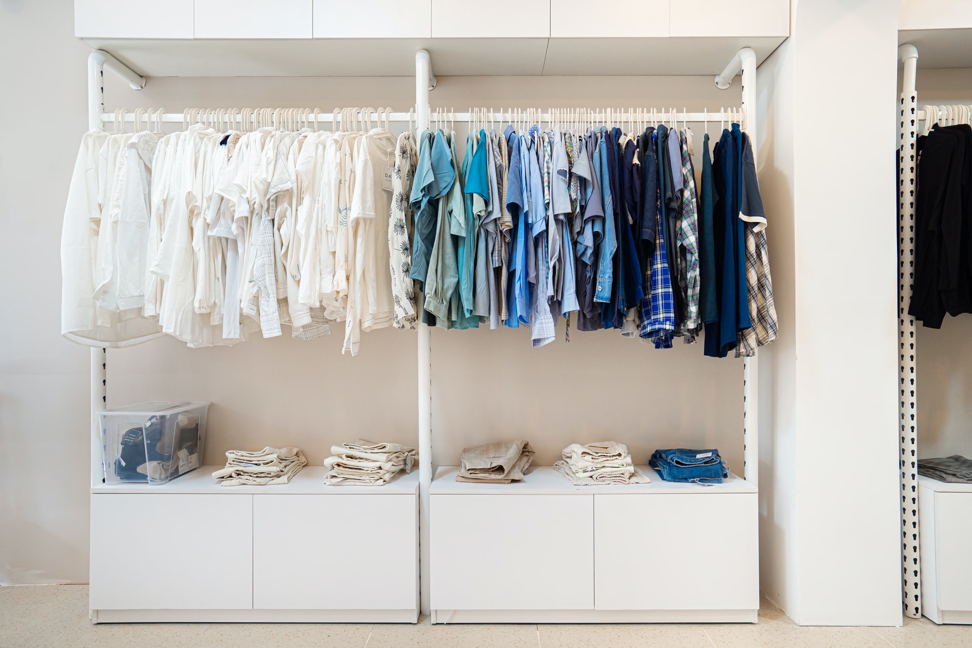
How many colours and designs can you support? I have found that this changes throughout life depending on external forces. I used to love a ton of colour in every room, but as my life has become more stressful and chaotic with kids, I’ve found that I like negative, calm spaces, design moments, and surprise more.
Do: Focus on the purpose of the room and let that guide your paint selection
A room where you want to have lots of lively and fun conversations may look (and yes, feel) different than a room where you want to curl up and watch movies on Friday nights. It may be similar for you too.
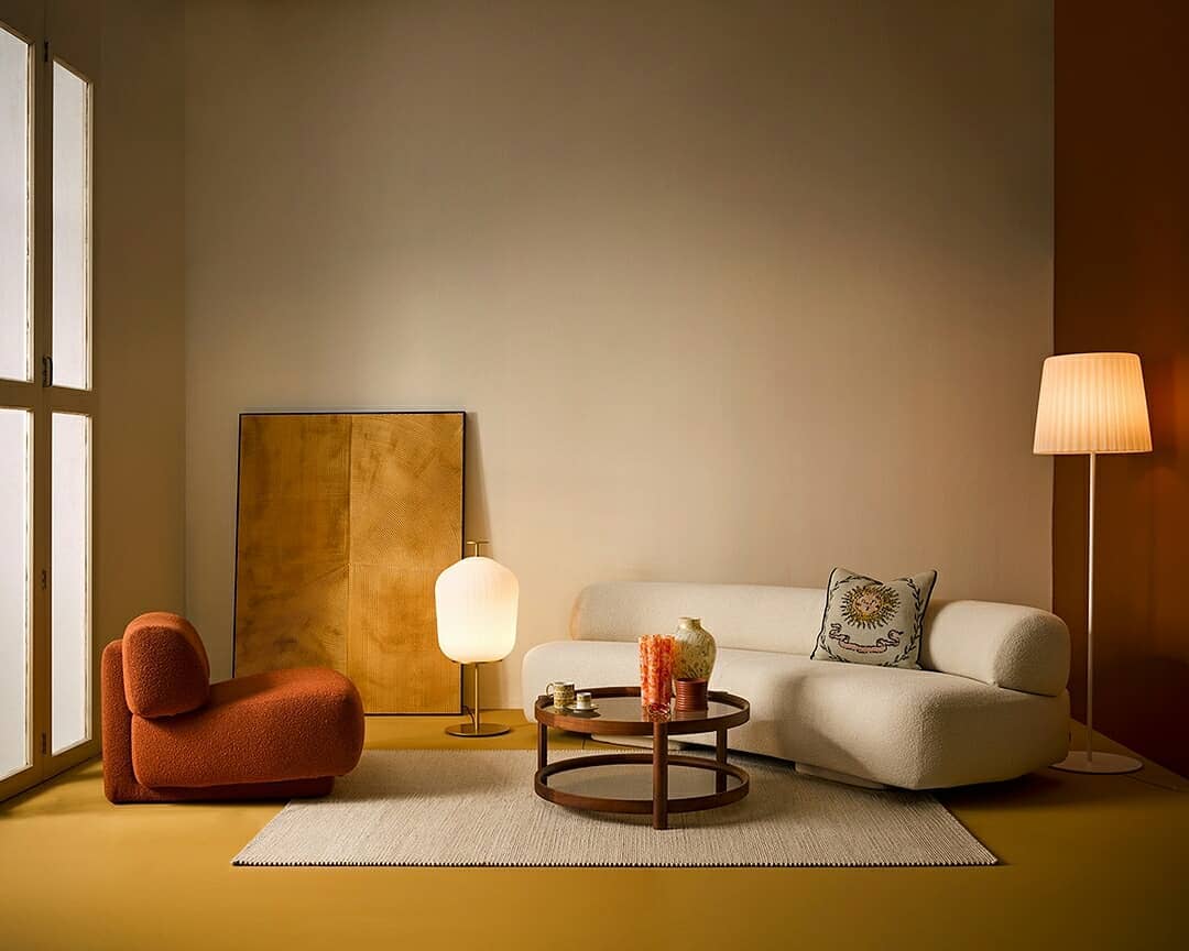
A TV room or study can be much darker in tone than a living room, for example. The master bedroom should help you relax and fall asleep, not overestimate your visual sense. A dining room can be more daring and exciting and a powder room can be the riskiest room in the house, becoming a secret experience for guests.
Do: have some darker colours to draw the eye into the room
I’ve made this mistake before, where everything is too even and light, which sounds good in theory, but the addition of a darker paint colour (or even a piece of furniture) on the opposite side of the room (think of a dining room that can be seen from the living room, or on the built-ins in the corner of your living room) can help draw you into the room and feel grounded. In fact, it makes the room seem bigger. Do not be afraid of a couple of surprises.
Don't paint a dark room "white"
The sad truth is that the rooms with the most natural light can be both light and medium and dark. But rooms with very little natural light can feel really «dead» and cold with just white paint on the walls and no light bouncing around. It doesn’t need to be dark, bold or ornate, just consider a warmer or more welcoming tone to warm up the dark space. Lean into the dark.
Don't forget your other permanent accessories
This is a reminder not to design in a vacuum. Do you like mauve? I like it too. But a mauve paint colour next to a mid-tone hardwood floor can compete and look muddled or create a charming cocooning feel; in any case, it’s important to see the two colours side by side (not just on a digital board). The same goes for tiles, fireplaces, and anything else more permanent you’ve already chosen, which brings me to my next point…
Do: choose the paint (almost) last
Listen to me. You have less colour flexibility with vintage rugs, wallpaper, and tiles than you do with paint colours, so pick those first (if you find them in time). I like to use those pieces as a starting point and then match the paint colour to them, making sure they fit well together. Paint companies have so many different shades of the same colour for precisely this reason: to give you endless options and flexibility, so you can work with anything in the home. So don’t try to find a rug that works with your paint selection – do it the other way around if you can.
Do: Consider the colours of nearby rooms
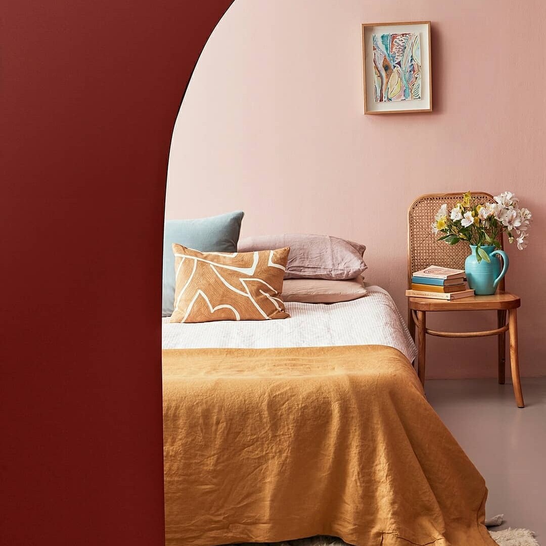
This is a bit specific but quite important – if you can see multiple rooms from one point of view – a living room you can see the kitchen, dining room and living room for example – make sure you select colours with that in mind. You don’t want the colours to be A. too close together that they look a bit muted or B. to look like a doll’s house (in a bad way). When putting together an outfit, you don’t choose the cardigan separately from the shirt you’re wearing underneath, no, you make sure you like how they sit next to each other because you see them at the same time.
Do not paint a wall an "accent" colour unless its own timing is architecturally justified
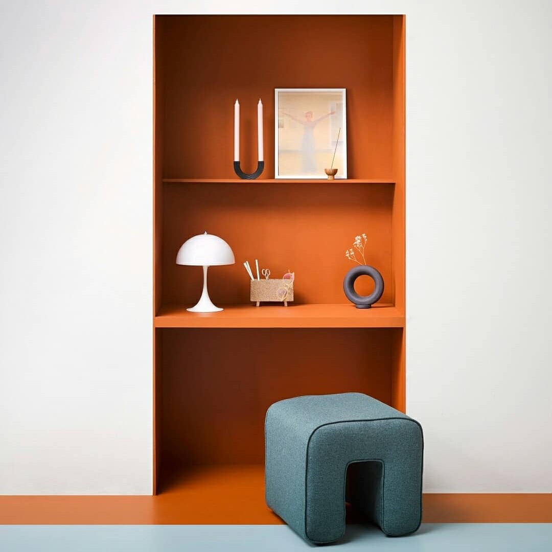
This is a general design craze: when a random wall is painted a bold colour for no reason other than to be different. An accent wall needs to warrant attention, it needs to be a focal point, not just randomly placed. My two favourite places for accent walls are behind a bed or in an alcove.
Don't think that every colour of paint has to be the star
This isn’t a «go big or go home» challenge on every wall, and unless you know the rest of your decor can handle it, you might be setting yourself up for too much. If you love colour a lot, you probably also have a lot of colour in your furniture/textiles and a bold colour on the wall might be too much once it’s in that context.
Do: Consider what you see through the windows of each room
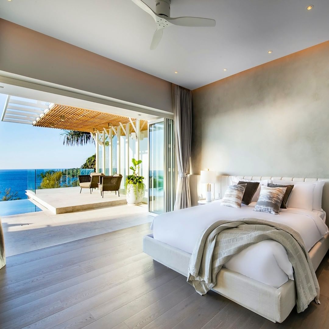
If you are surrounded by the sea, you may not want your walls to be blue, so that the colours outside stand out and are the centre of attention. If you’re facing an apartment building you don’t like or you’re directly on the street, you can draw the eye further in by painting the room a more cheery tone (also consider bottom-up curtains for privacy without blocking the view). natural light).
You see it? There is a LOT to consider before you even get to selecting the right colour itself. Remember, the key to a great home that you love is leaning on your personal preference and knowing how you want to use the home – my hope is that with a little guidance and foresight we can all reflect, think, ask questions and then paint, not paint. reverse.

