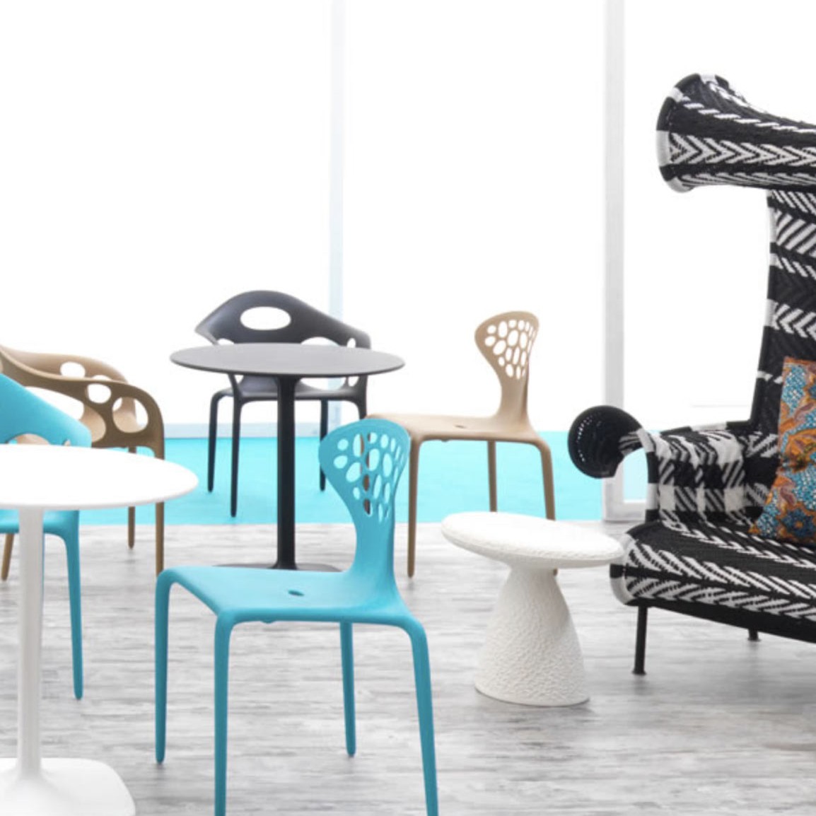
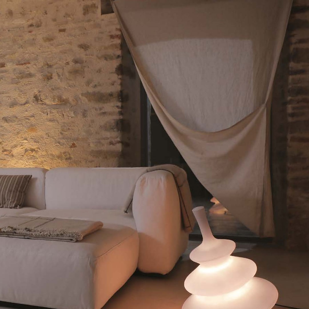
DESIGN ERROR: Too much furniture in one room
I think it’s safe to say that we’ve all been looking at our furniture a little more these days. Strange coincidence, I know. But if you’re ready and want to shake things up in your space that requires the least lift on a zero budget then this post might give you the inspiration to do so. The number one design dilemma we’ve been asked by many of our clients is, «Help, how do I lay out my room?»
Now, what if I told you that ALL questions have a common denominator? We realized that it wasn’t so much the arrangement of the furniture in the space as there was too much or too little in the right scale. Shocking and true. However, the good news is that it is a fairly easy fix. This is how our new “Design Mistake: Too Much Furniture” was born.
So you’re looking at your room again, and now you think this might be your problem too? Well, today we are going to give you all the tips and tricks you need to FIX/avoid this from happening to you with the help of salon agonies from our real readers. So we will all learn together.
Join me as we dive into the mistakes below… but first, let’s take a moment to look at someone else’s furniture. Ahhhh thank you, that was relaxing.
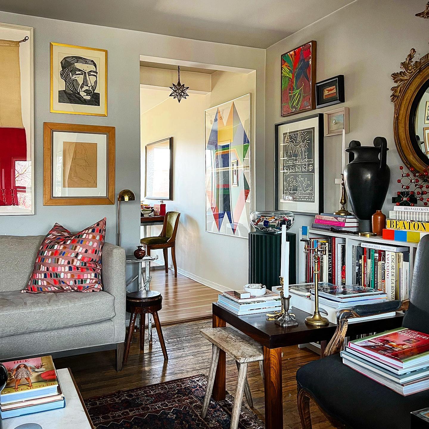
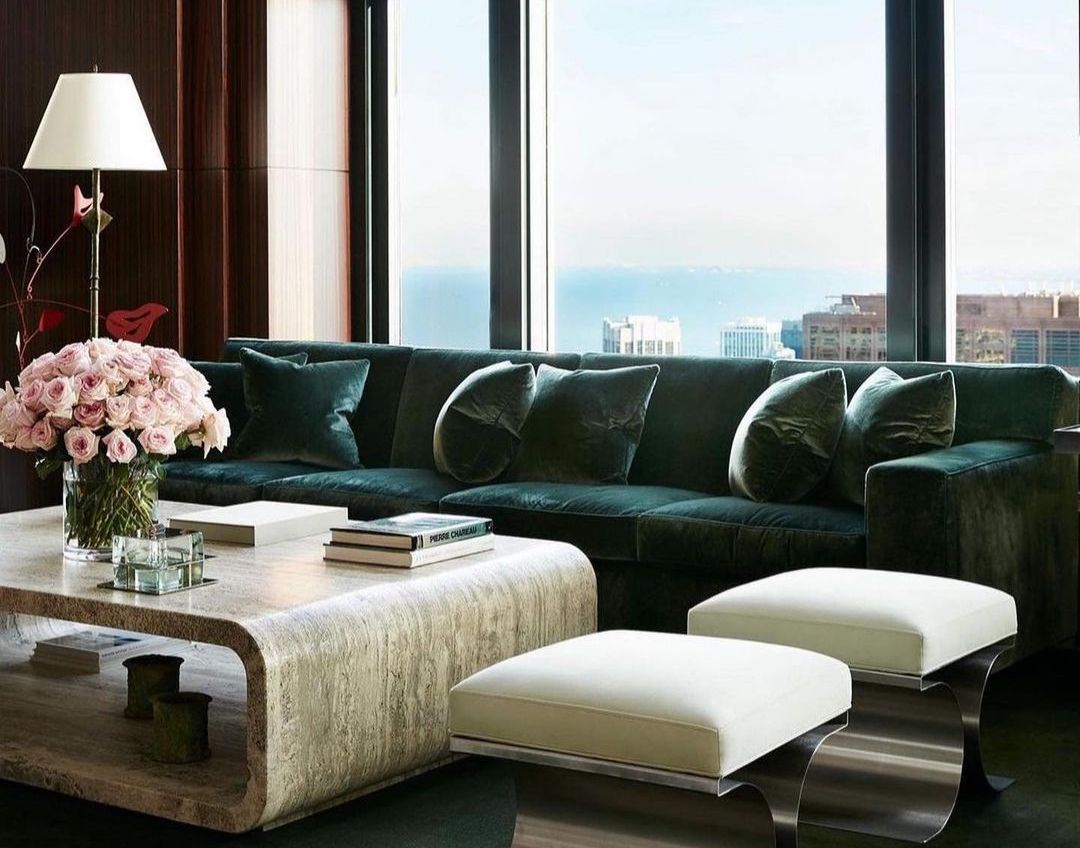
Why it doesn’t work: When there are at least 6 chairs/sofas, 4 tables, and 1 sofa in a room it may be time to remove some to make that big space feel really spacious. The solution could be as simple as removing the armchair (with books on it) and the side table (which is too high). That’s it, that’s better. Though I think having all the matching pieces in a similar colour palette helps the space not feel too overwhelming, unlike the space below.
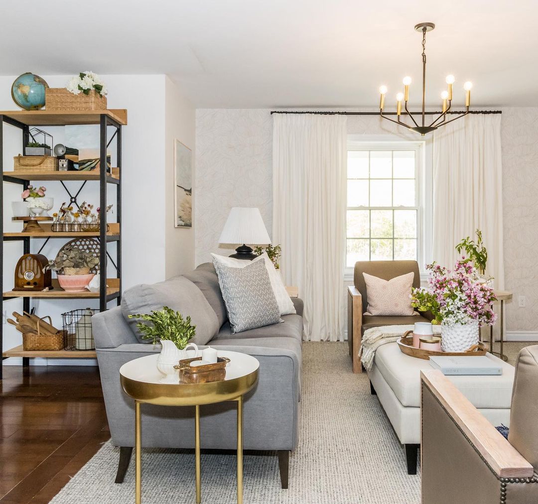
Why it doesn’t work: This is a slightly different problem. Here the furniture is simply too close together. There is not enough space between the sofa and the central upholstered bench in the centre. The same goes for armchairs. The distance between the armrests (sharp-looking) of the armchairs and the sofa is also not enough to pass comfortably. By the way, having solid arms in the armchairs also takes away the feeling of space that the room could have.
We are not going to mention the more than fifty pieces on the shelf.
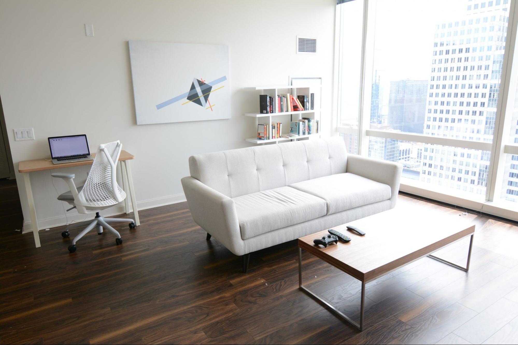
Why it doesn’t work: We’re not telling you to be a crazy «minimalist» like in the house above, either. You don’t want your house to feel empty and sad. The upstairs space lacks that homey feel because it lacks texture, warmth, and, you know, a side table.
Some Rules
So how do we find the balance between having to squeeze our bodies between two chairs, a table, and a sofa or being able to do a “Front Handstand, Round Back Handstand, Round Back Handstand, Full Twist?” » without hitting a single piece of furniture? That’s next…
In case you need a refresher, here are a few to get you started:
Leave 75cm to 100cm of space between large pieces of furniture (if your living room allows it), if not, at least 45cm – 60cm.
Make sure there is no less than 1m and no more than 3m of space between the seats.
If possible, sofas should never be flush with the wall. Pull it out 7cm – 10cm and give it some room to breathe.
Your coffee table should be at least half the length of your sofa and no more than 8cm taller or shorter than the top of the sofa seat cushions.
The ideal distance between the sofa and the coffee table is 40cm to 45cm.
The rug should be large enough so that at least the front legs of the sofa and all the chairs rest on it.
Side tables should be no deeper than the depth of the sofa and keep the end table close enough to set down a drink with ease. Which is usually 5cm – 7cm from the height of the arm.
Accent chairs should have around 100cm (size of your arranged room) between a set of living room accent chairs to be able to fit a small table in the middle. For a smaller room, simply place the chairs side by side.
When pairing a sofa and accent chairs, choose seat heights that are less than 4″ apart.
Make sure the console is the same height or a few inches shorter than the back of the sofa. In addition, the ideal is that it has about 15cm of space at each end.
The distance between the TV and the sofa should be about 18cm and an optimal height for the centre of the screen is 75cm above the lowest seat height in the room.
Do you have all that? I know, it’s a lot of information and this is just the living room. Sometimes interior design can be overwhelming, so we love to help out when we can. I love working on these mini-projects and getting to know you better, it’s a really fun part of my job.
Main Image: ellealyss
How to Style Your Home on a Shoestring Budget
As a designer and homeowner, I’m constantly asked where to save or splurge at home, and for me it’s a deeply personal question: we all deserve to enjoy what brings us the most joy.
With that said, budget constraints are very real and we all have to make tough decisions sometimes when it comes to interior design.
Regardless of how big or small the project is, there are always limitations due to budget, but I choose to see them as opportunities, as they ultimately give you the push you need to create an interesting design.
For me, the success of design is always a question of balance, it is a conversation between form, texture and materiality.
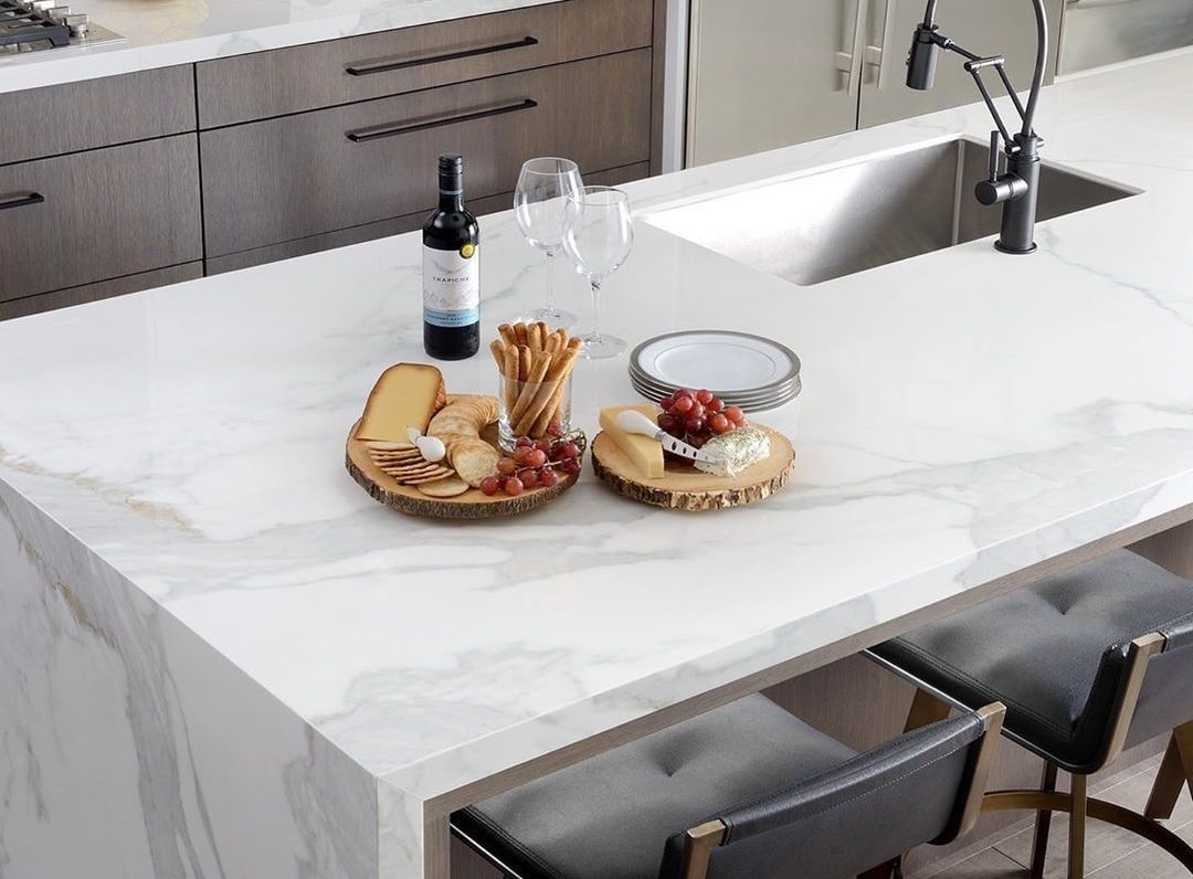
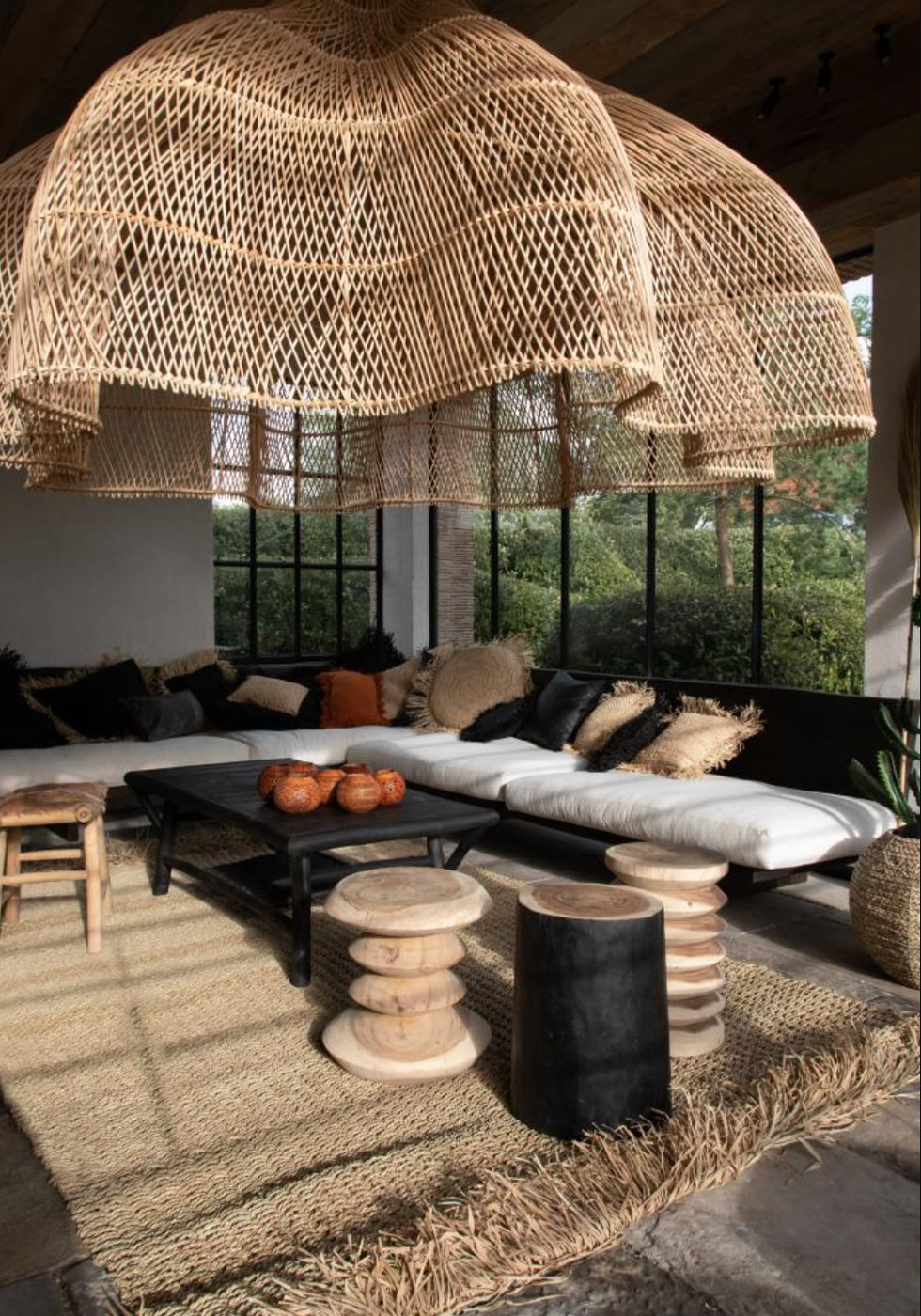
For this reason, although I have high-end elements in my house, such as the precious Blanco Macael marble from Almeria in the kitchen, I have chosen to combine the stone with a more humble material such as rattan, which can be seen throughout the house in the form of lampshades and rattan stools from the 70s.
I’m always looking for unique vintage pieces at resale sites, antique stores, garage sales, or markets. You’ll be amazed at how much treasure you can get at affordable prices if you’re willing to spend time searching. There is nothing better than the emotion of finding a unique piece for less than 50 euros.
If there is a designer piece that you love, then I encourage you to hold off and invest in something you could potentially have for 20+ years like a sofa or dining table. Once you know the name of the brand and the style, proceed to search for it on all the resale sites available to you: Facebook market, Etsy, etc, I have them all! Of course, if there is a piazza you are looking for and you cannot find it, come to our studio and we can look for it among all our contacts.
If you find it yourself, don’t be afraid to negotiate the price. Take the risk and bid lower on auction sites and see what happens. I have even offered up to 50% less on items and they have accepted them. You never know when a seller needs to get rid of something. We can take care of the negotiation as part of a larger project.
I will also add that this is a much more personal and sustainable approach to design and as a bonus these investment pieces often have a good resale value if your style changes over time. After that, the art is really in the high/low mix and the way both investment design pieces and modern furniture brands are styled in your space.
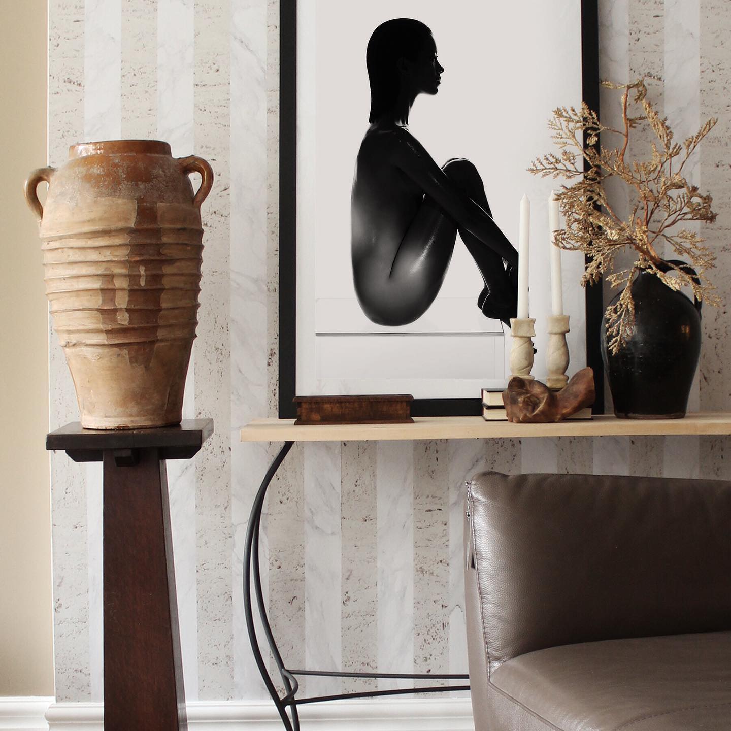
Image : bettencourtmanor
I’m always looking for unique vintage pieces at resale sites, antique stores, garage sales, or markets. You’ll be amazed at how much treasure you can get at affordable prices if you’re willing to spend time searching. There is nothing better than the emotion of finding a unique piece for less than 50 euros.
If there is a designer piece that you love, then I encourage you to hold off and invest in something you could potentially have for 20+ years like a sofa or dining table. Once you know the name of the brand and the style, proceed to search for it on all the resale sites available to you: Facebook market, Etsy, etc, I have them all! Of course, if there is a piazza you are looking for and you cannot find it, come to our studio and we can look for it among all our contacts.
If you find it yourself, don’t be afraid to negotiate the price. Take the risk and bid lower on auction sites and see what happens. I have even offered up to 50% less on items and they have accepted them. You never know when a seller needs to get rid of something. We can take care of the negotiation as part of a larger project.
I will also add that this is a much more personal and sustainable approach to design and as a bonus these investment pieces often have a good resale value if your style changes over time. After that, the art is really in the high/low mix and the way both investment design pieces and modern furniture brands are styled in your space.
Smart and stylish tips for sustainable interior design
Both homeowners and consumers are becoming more aware of the products they use and how they affect the environment. As technology advances, designers come up with alternatives that offer a better solution to the problem of a rapidly changing environment. Many now consider it a responsibility to commit to products that are not as harmful or that reduce the amount of waste they contribute. Here are some of the ways the design world has embraced the sustainable design mind-set and is doing what it can to move towards a less wasteful future.
How to decorate your house with a sustainable interior design
As we become more aware of the impact our daily lives have on the environment, our interior designers are always on the hunt for the best eco-friendly and sustainable interior design techniques to maximize the efficiency of our clients’ homes and help reduce your impact by keeping everything green.
From building a vegetable garden to starting a composting routine, there are many things that can be done to help the environment while benefiting personally, but how do you approach sustainable interior design?
To help you start introducing sustainable interior design in your home, we’ve put together a quick checklist that you can put into action to reduce your environmental footprint beyond solar panels, and no, upcycling furniture isn’t one of them…
Recycled Materials
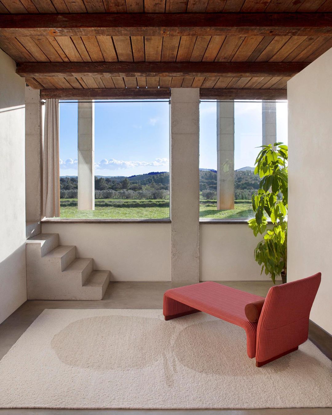
Image from gan_rugs : Handmade rug with sustainable and natural fabrics
Many brands are letting “zero waste” transcend industries, even incorporating it into interior design. When you consider the decoration, look if you can for a product that maintains this zero waste policy, and that is made from recycled materials that would have been thrown away instead.
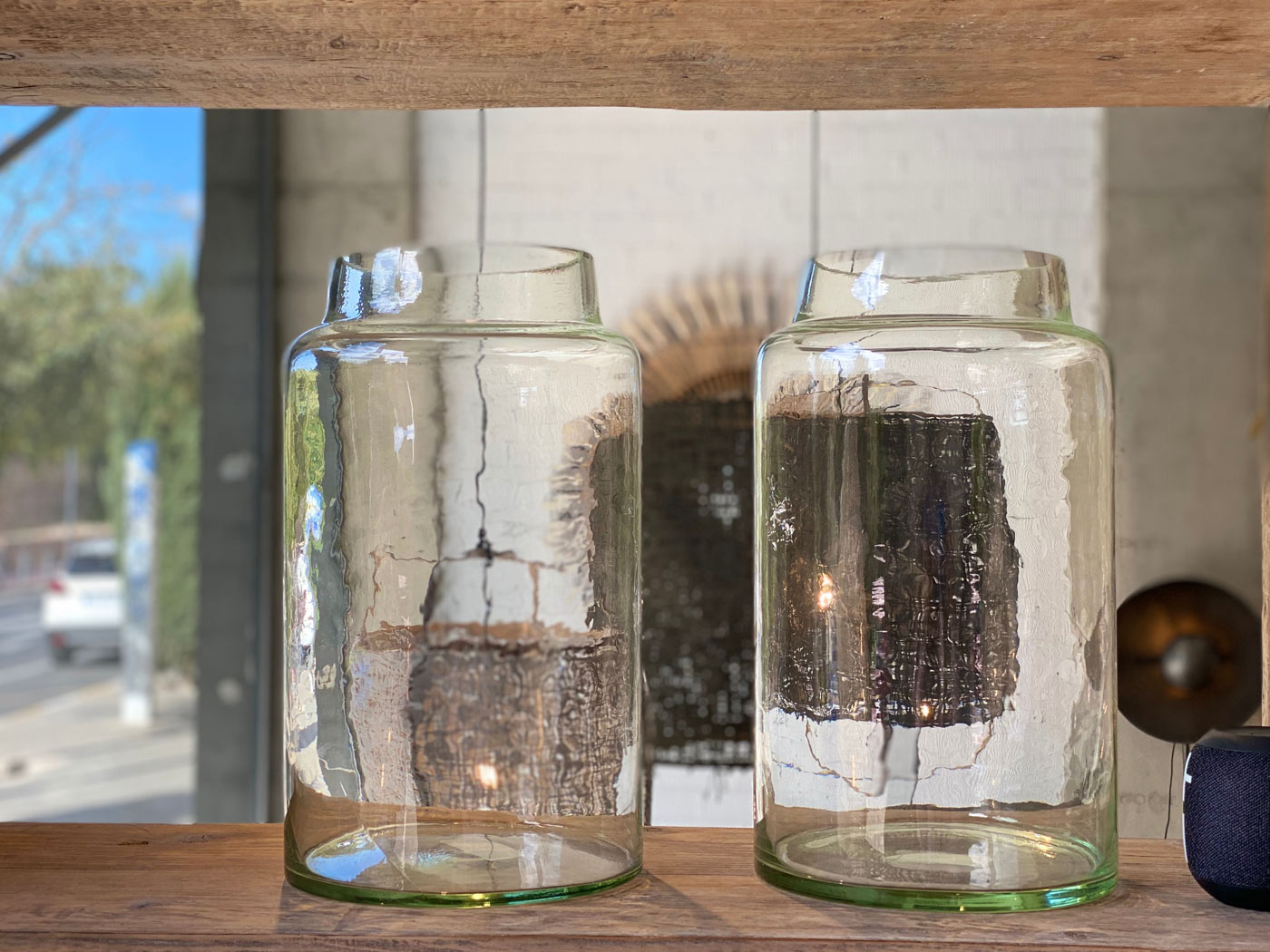
Sublime, interior design & real estate – San Juan, Alicante
Glassware, pots and planters are emerging as eco-friendly products made from recycled materials, as are textiles and fabrics woven from other reusable materials, making them more durable and resistant.
Select lighter colours
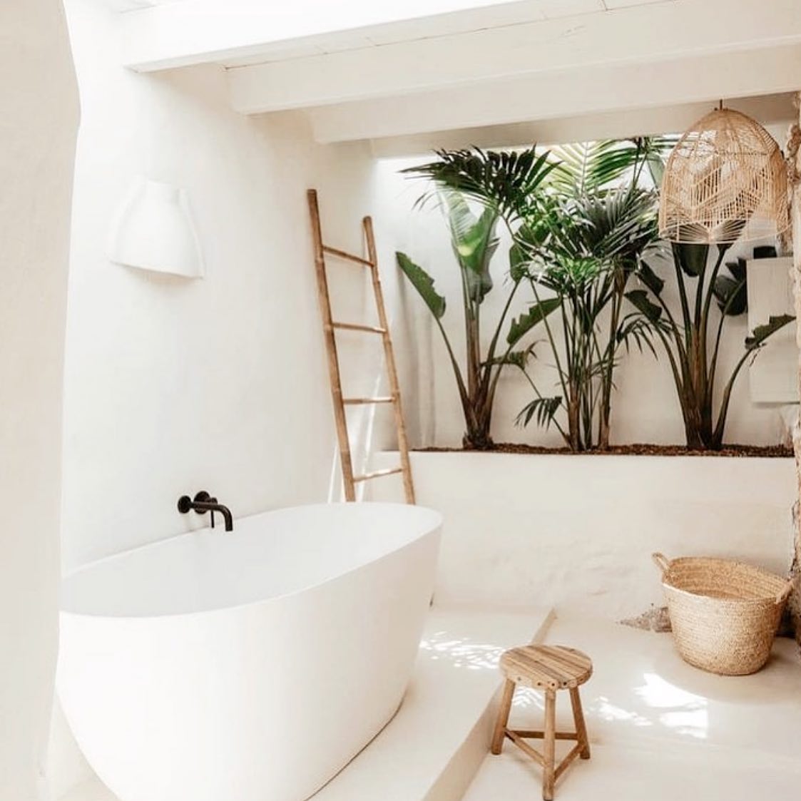
To save money and energy on lighting, reconsider your approach to your main colour scheme, as paler hues will reflect more light, while darker walls and décor need more artificial lighting. To help you do without the toxic chemicals and fumes found in most paints, there are also a variety of paint companies now creating less abrasive options that are better for the environment and your home. For more tips, check out our recent blog on choosing colours for your home.
Another sustainable interior design practice that our designers often take advantage of is incorporating reflective surfaces to increase the amount of light that bounces from room to room and reduce the use of artificial lighting.
Ecological Furniture
Look for companies committed to sustainable interior design through the use of eco-friendly materials and ethical production practices – it’s part of our process of choosing furniture when we’re doing projects.
And, as with any purchase, look for built-to-last pieces that you won’t grow tired of after a few years.
Install window treatments
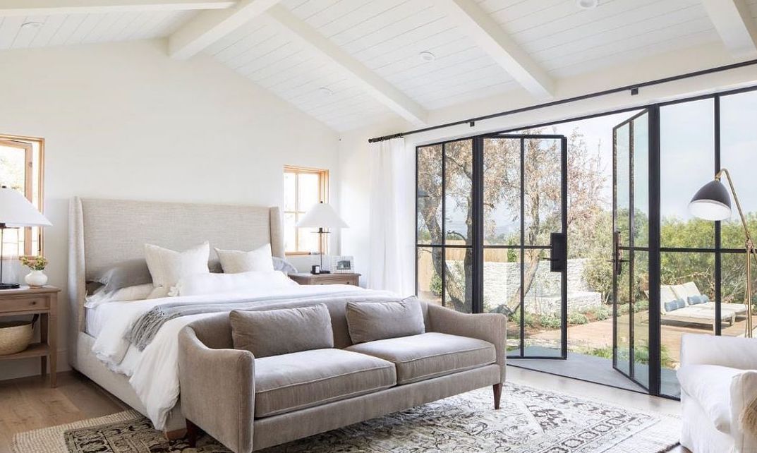
Design:burkhartinteriors
When it comes to sustainable interior design, heating, cooling and lighting are three of the easiest ways our designers use to make our clients’ homes as green as possible. As most of the heat in buildings escapes through windows, it is essential that these are of the highest quality and ensure adequate insulation.
And if you haven’t been blessed with the best windows and upgrading them is out of your budget, window treatments are a smart option that’s easy to manage and install, keeping cool air and the sun’s heat out while they allow you to control the temperature of your home by opening and closing them when necessary.
How can you do your part?
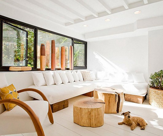
You can also work with what you have to make your home more sustainable, energy efficient, and less wasteful in ways that don’t require big leaps. Every action counts, so don’t be afraid to start small.
When redecorating, you’ll also want to look for materials that are actually more sustainable. Think about how often you change furniture, decor, or appliances.
You’ll produce less waste if you keep the same pieces and can consider new furniture a real investment.
Eliminate single-use decor and supplies from your kitchen and dining room. Instead of thin paper towels, cups, napkins or plates, replace them with ceramic tissues, cups and plates. In addition to being much better quality, they also look better.
Main Image tropicc.co
The do’s and don'ts to choose the paint for your whole house
My sister’s house was painted 50 shades of light blue when they bought it, and it wasn’t sexy at all. All the rooms, the bathrooms, the study, the closets, etc., except the main entrance, had different subtle shades of the same light blue shade. Clearly, the last owner suffered from «whole house paint paralysis» and only went with the «one and done» approach. I get it: Choosing 11 different paint colours at the same time is challenging, it’s daunting, and it’s a lot at once, especially in the midst of all the other decisions you’re probably making.
In a perfect world, you paint one room at a time and see how it looks and feels before moving on to the next. But whether you’re repainting one room to work with the rest of your house already painted or have to choose all of them at once, there are things to keep in mind. There is knowledge for those who have done this before, which can help you do what we all want in life: mitigate regret and optimize the happiness of our home.
Do: Ask yourself some important questions about the big picture
I don’t want to be too existential, but if the design of your home is mostly about your personal preferences, about how YOU live, then you need to seriously consider the answers to these questions before choosing paint lightly.
How do you want to feel when you’re in the room? I know I look like a broken record, but it’s super important that you let the feel of the room dictate what it looks like, not the other way around. Do you want to feel cozy? Feel comfortable? Or feel like partying?
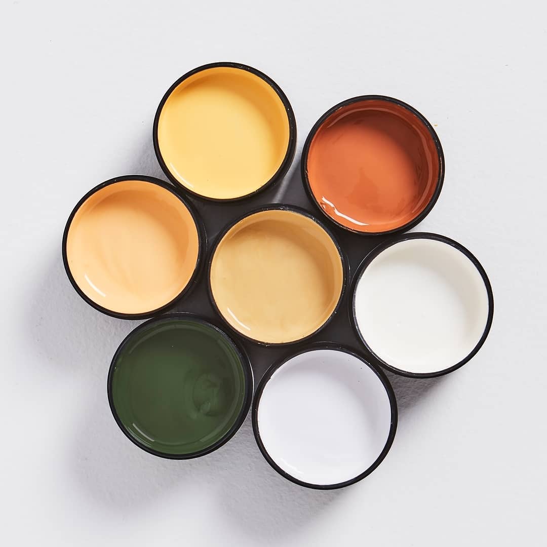
Do you want all the colours in the house to work together or do you prefer to have different exciting experiences in each room? The level of overall colour cohesion is absolutely a personal preference and really comes down to what you can stand. I like open spaces to have a common vibe and colour palette, but if rooms are separated from each other by doors, then you have more freedom to create different colour experiences.
What are your true comfort colours? The ones that always make you happy. Choose your comfort colours for the main spaces (take a risk in the less busy rooms). Although paint is easier to replace than wallpaper, it’s also good to get into the habit (which I’ve had to break) of not «buying something you could return,» even if it’s a coat of paint. If you have never opted for a lavender-coloured scarf in your life, then be wary that you may be falling for a trend that is misleading your true emotions (tastes) in the long run.
Do: Look at your favourite "everyday" clothes... what are your comfort colours?
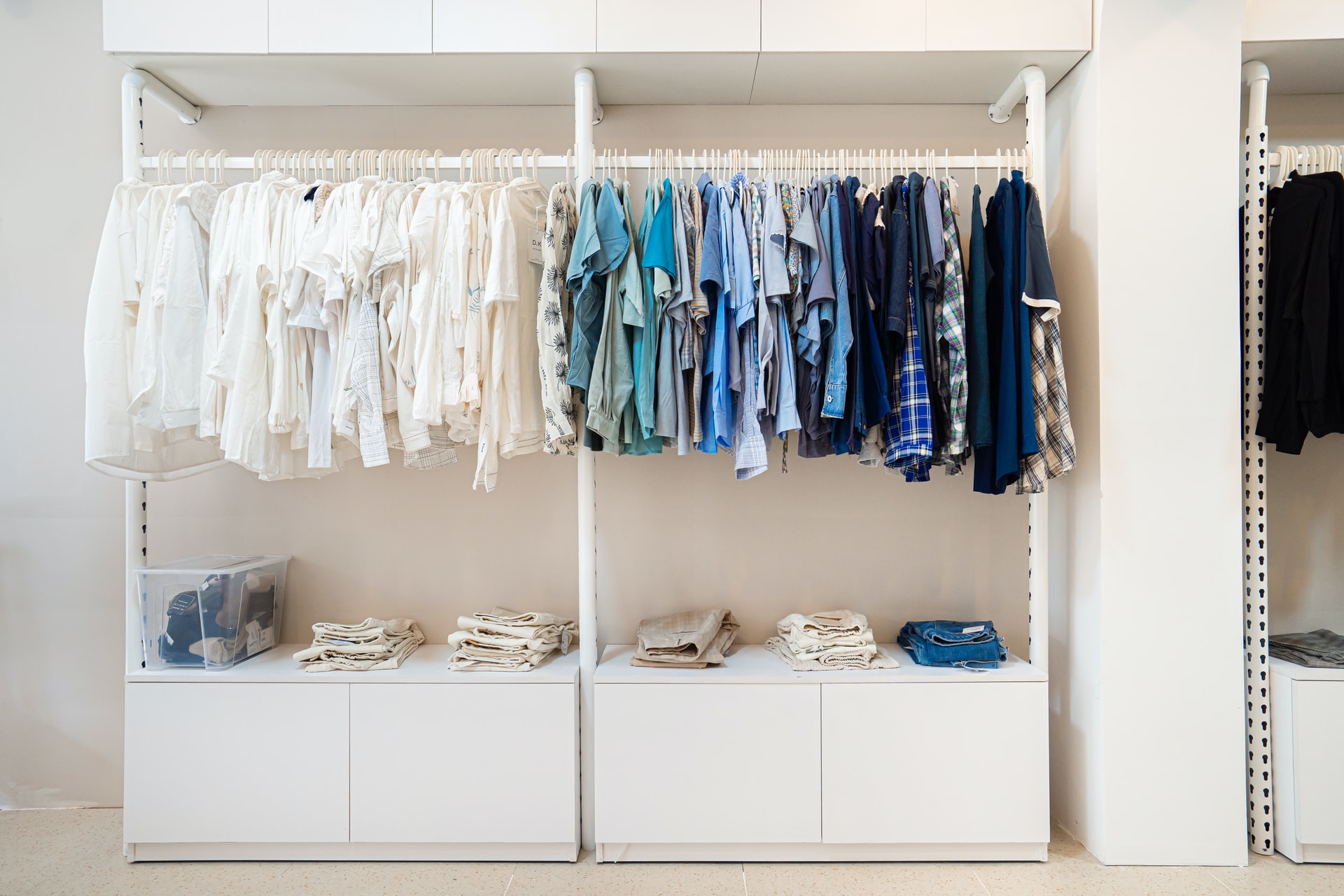
How many colours and designs can you support? I have found that this changes throughout life depending on external forces. I used to love a ton of colour in every room, but as my life has become more stressful and chaotic with kids, I’ve found that I like negative, calm spaces, design moments, and surprise more.
Do: Focus on the purpose of the room and let that guide your paint selection
A room where you want to have lots of lively and fun conversations may look (and yes, feel) different than a room where you want to curl up and watch movies on Friday nights. It may be similar for you too.
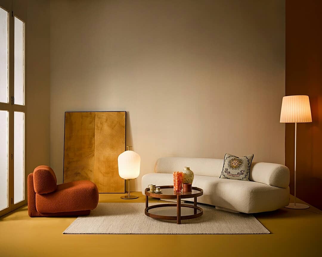
A TV room or study can be much darker in tone than a living room, for example. The master bedroom should help you relax and fall asleep, not overestimate your visual sense. A dining room can be more daring and exciting and a powder room can be the riskiest room in the house, becoming a secret experience for guests.
Do: have some darker colours to draw the eye into the room
I’ve made this mistake before, where everything is too even and light, which sounds good in theory, but the addition of a darker paint colour (or even a piece of furniture) on the opposite side of the room (think of a dining room that can be seen from the living room, or on the built-ins in the corner of your living room) can help draw you into the room and feel grounded. In fact, it makes the room seem bigger. Do not be afraid of a couple of surprises.
Don't paint a dark room "white"
The sad truth is that the rooms with the most natural light can be both light and medium and dark. But rooms with very little natural light can feel really «dead» and cold with just white paint on the walls and no light bouncing around. It doesn’t need to be dark, bold or ornate, just consider a warmer or more welcoming tone to warm up the dark space. Lean into the dark.
Don't forget your other permanent accessories
This is a reminder not to design in a vacuum. Do you like mauve? I like it too. But a mauve paint colour next to a mid-tone hardwood floor can compete and look muddled or create a charming cocooning feel; in any case, it’s important to see the two colours side by side (not just on a digital board). The same goes for tiles, fireplaces, and anything else more permanent you’ve already chosen, which brings me to my next point…
Do: choose the paint (almost) last
Listen to me. You have less colour flexibility with vintage rugs, wallpaper, and tiles than you do with paint colours, so pick those first (if you find them in time). I like to use those pieces as a starting point and then match the paint colour to them, making sure they fit well together. Paint companies have so many different shades of the same colour for precisely this reason: to give you endless options and flexibility, so you can work with anything in the home. So don’t try to find a rug that works with your paint selection – do it the other way around if you can.
Do: Consider the colours of nearby rooms
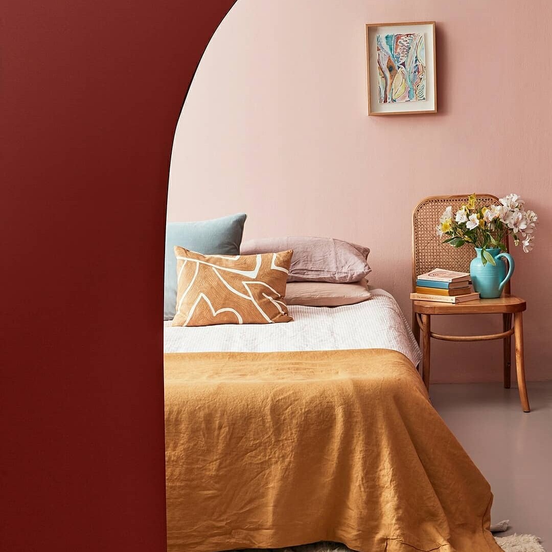
This is a bit specific but quite important – if you can see multiple rooms from one point of view – a living room you can see the kitchen, dining room and living room for example – make sure you select colours with that in mind. You don’t want the colours to be A. too close together that they look a bit muted or B. to look like a doll’s house (in a bad way). When putting together an outfit, you don’t choose the cardigan separately from the shirt you’re wearing underneath, no, you make sure you like how they sit next to each other because you see them at the same time.
Do not paint a wall an "accent" colour unless its own timing is architecturally justified
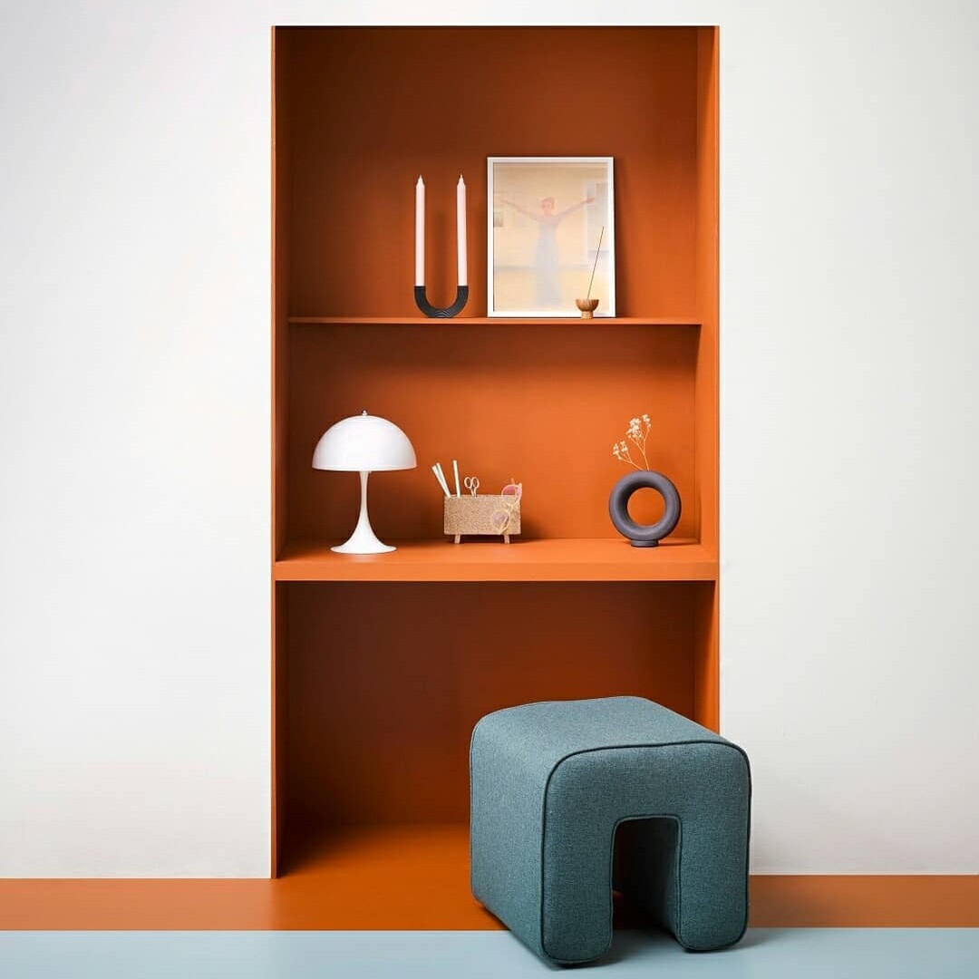
This is a general design craze: when a random wall is painted a bold colour for no reason other than to be different. An accent wall needs to warrant attention, it needs to be a focal point, not just randomly placed. My two favourite places for accent walls are behind a bed or in an alcove.
Don't think that every colour of paint has to be the star
This isn’t a «go big or go home» challenge on every wall, and unless you know the rest of your decor can handle it, you might be setting yourself up for too much. If you love colour a lot, you probably also have a lot of colour in your furniture/textiles and a bold colour on the wall might be too much once it’s in that context.
Do: Consider what you see through the windows of each room
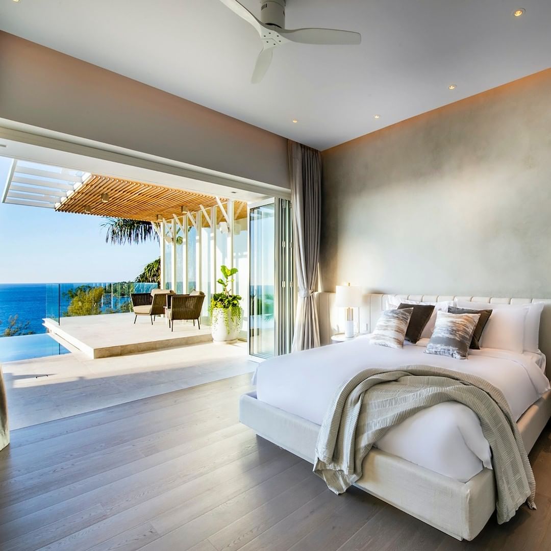
If you are surrounded by the sea, you may not want your walls to be blue, so that the colours outside stand out and are the centre of attention. If you’re facing an apartment building you don’t like or you’re directly on the street, you can draw the eye further in by painting the room a more cheery tone (also consider bottom-up curtains for privacy without blocking the view). natural light).
You see it? There is a LOT to consider before you even get to selecting the right colour itself. Remember, the key to a great home that you love is leaning on your personal preference and knowing how you want to use the home – my hope is that with a little guidance and foresight we can all reflect, think, ask questions and then paint, not paint. reverse.
I tell you about the piece of furniture that Gen Z wants... it turns out that we do too
The first time I had a dressing table in my room was in my first apartment in Alicante shared with friends. Luck was on my side as I got to choose the largest room with a BUILT-IN vanity. I tried to find a picture of it but I wasn’t that good at taking pictures (or backing up my computer) in 2007.
Still, the feeling of being a grown woman washed over me like a delicate spray of expensive perfume the moment it was officially mine. I imagined how elegant and grown-up I would feel sitting on a vintage stool in front of my vanity mirror while probably wearing something resembling a long silk robe. I’m not sure if it was the movies, the musicals, or the older women in my life that created this huge imprint, but regardless of the influence, it was real and I’m still under it. However, I am not alone… Generation Z also wants to participate.
When my friend Julia renovated 17-year-old Olivia’s bedroom, one of Olivia’s main requests was for a dresser. Since Julia likes to make her clients happy, she upgraded it by turning it into a dresser/desk since, you know, it’s a silly chore.
Then, as I was looking at what was new from some of our vendors, I realized that they had thousands of vanity options. My conclusion, given these two strong pieces of information, Gen Z wants in vanities. Like me, as a 22-year-old who longs to be older, they probably feel the same way. But instead of its primary purpose being a place to get «perfect», it’s now more about self-care. That’s how it should be, right?
If you’re like some of us at Sublime Alicante, you’ve fully immersed yourself in the skincare life during quarantine. In fact, creating a solid routine was one of my biggest achievements, as washing my face daily was a 50/50 chance before the quarantine. Look, some of us are late.
I had a built-in vanity in my last apartment. It was a huge bonus and was probably what made me say «I’ll take it!» within three minutes of entering. I thought, «FINALLY, after 10 years without a dresser, I’m back, baby!» Well, that was until I moved out. There are over 1,000 things I love about my new apartment, but having a built-in vanity isn’t one of them. Honestly, I wasn’t even looking for one yet, but then I came across this awesome vintage outfit at Madrid’s Rastro.
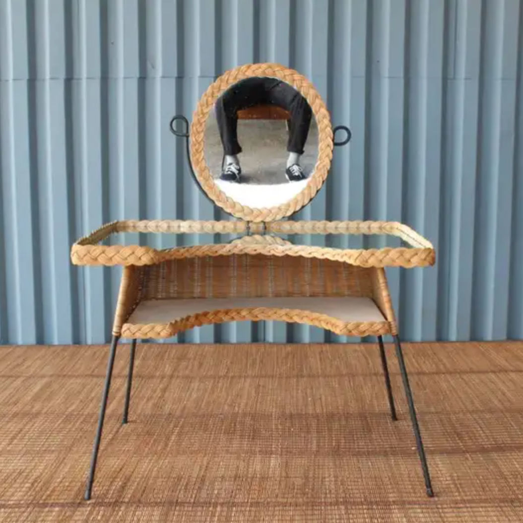
But that was my case.
Let’s start with a good wooden dresser. Wood always brings texture and warmth to a space.
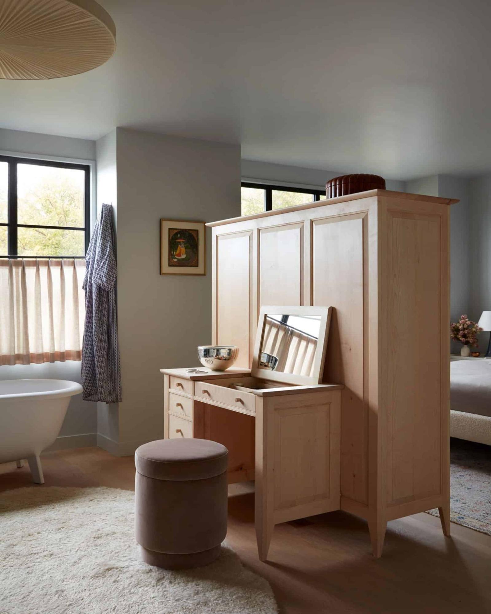
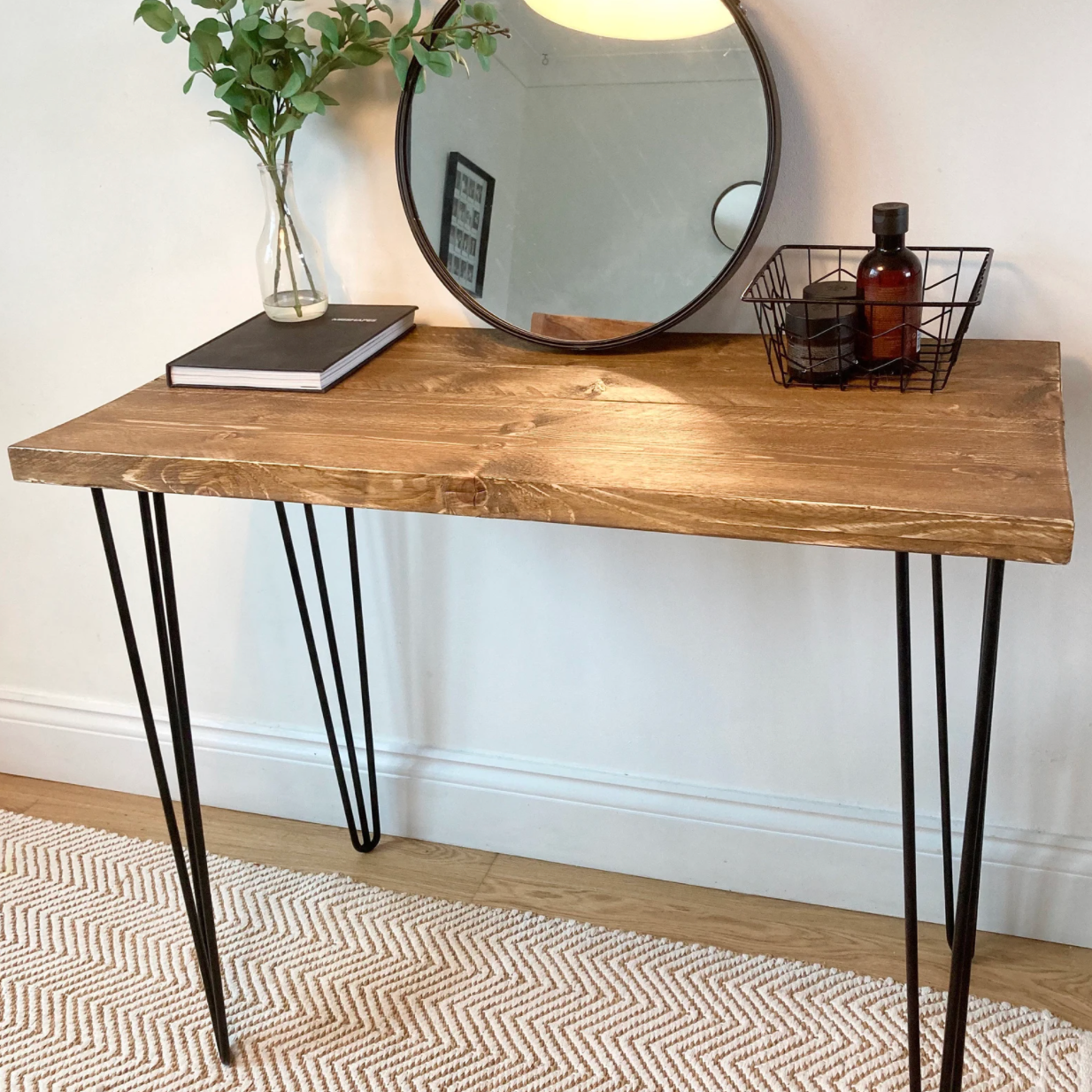
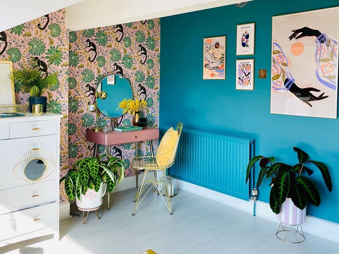
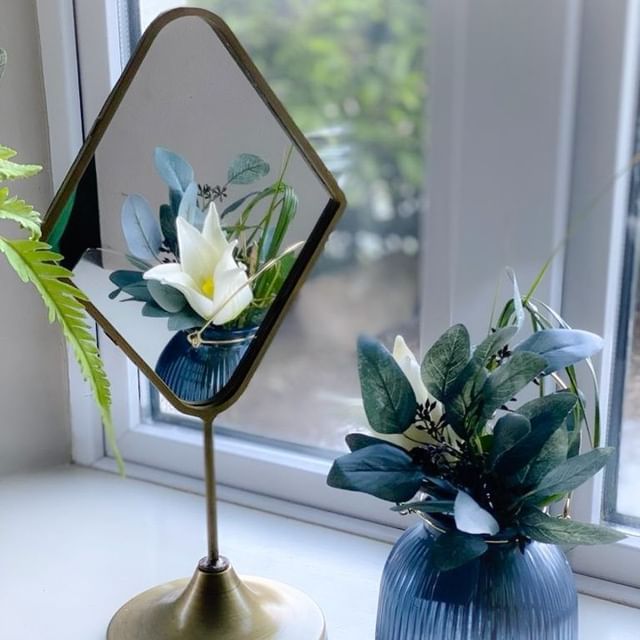
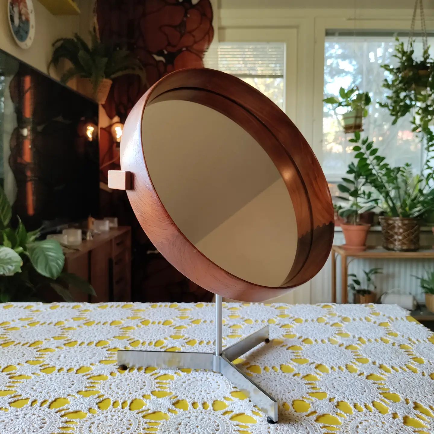
We can’t all have a dressing table. If only. Space can be a real jerk in this department. All you want to do is sit back and put on your eye cream like the luxurious person you are. But if you take a tabletop mirror, any table or desk can become a temporary dressing table.
So what do you think? Do you have similar feelings towards having a vanity table? Do you have one and love it? Do you not like it and prefer to stand while doing all your routines?
If you are the parent of a Gen Zer, do they have or want one?
Featured Image by our_townhouse_by_the_sea
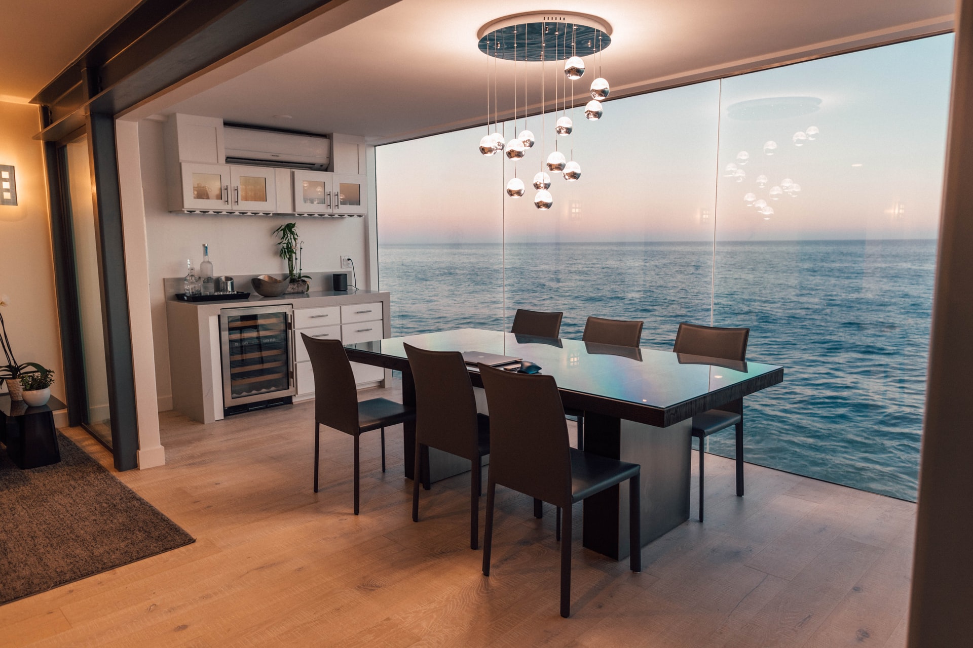
Our "rules" for an ideal dining room
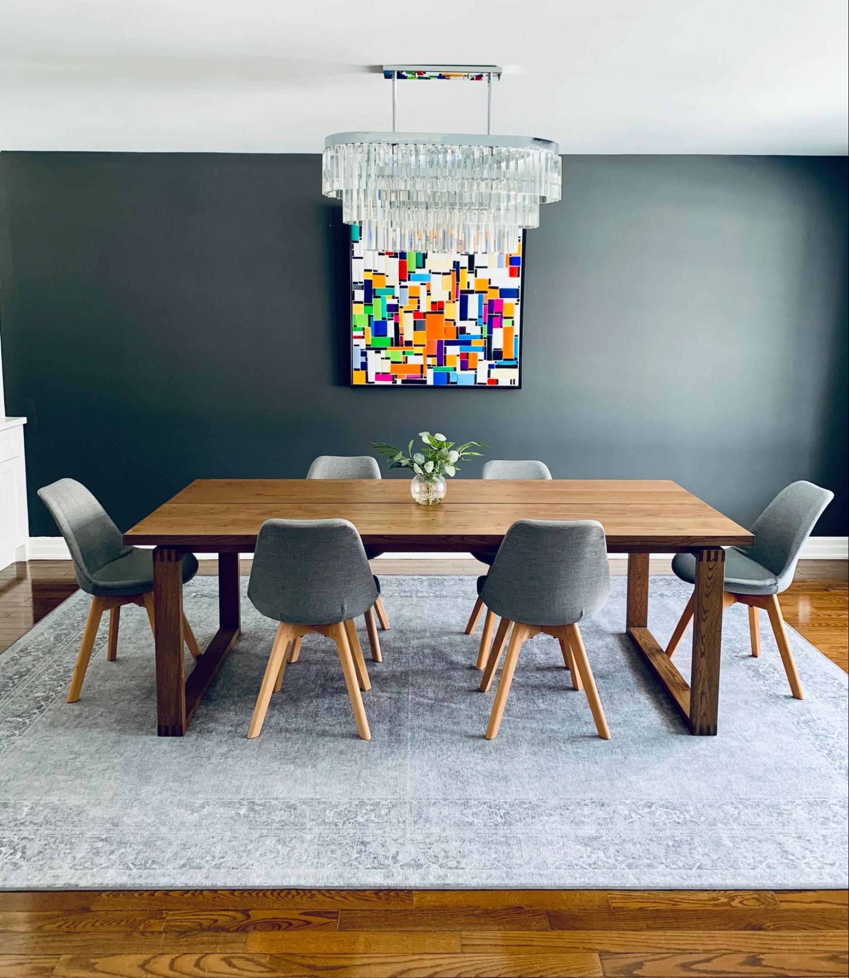
We’ve decided to break down some of the dining room rules you should follow in your own home. The purpose of these tips is not to give hard rules to follow (or reprimand you if you don’t follow them) but rather to give you guidelines that can help you make the room feel as cohesive and harmonious as possible. Think of it as the cheat sheet of what your dining room should do. There are always exceptions to the rules, but to break them… you first have to know them. So let’s get down to business.
Furniture Placement
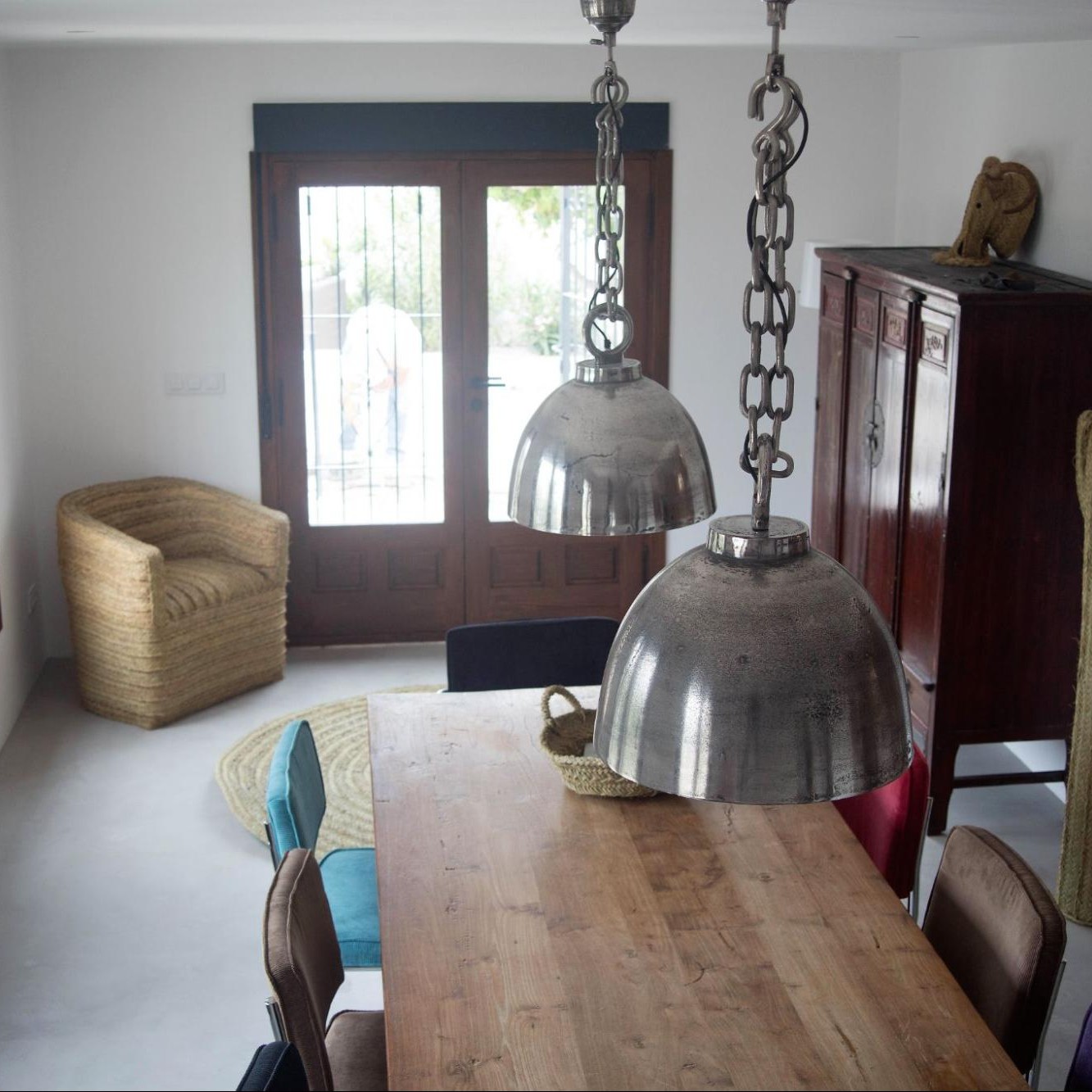
RULE: Give 75cm to 100cm of space between large pieces of furniture (if your dining room allows it) if not, then at least 45cm – 60cm.
You know how when you’re sitting on a flight and the flight attendant pushes that little cart down the aisle hitting every sleeping shoulder on the way? Well, it’s not the flight attendant’s fault, it’s the space they have to move. Don’t let your dining room be that airplane aisle. Make sure you have at least 60cm of space around your dining table so that people can move freely around it without having to bump into all the diners on their way to use the vanity.
RULE: Leave about 60cm of space per person for maximum comfort and enjoyment of the meal.
Here is a guideline for seating for rectangular tables based on size:
- 120cm long table: seats 4
- 150cm – 180cm table: seats 6
- 200cm – 220cm table: seats 8
- 230cm – 275cm table: seats 10
- 300cm table: seats 12
And for round tables according to size:
- 100cm – 120cm diameter table seats 4
- 150cm diameter table seats 6-8
Similar to the previous one. Instead of for the space around your table, this is for the space on your table. This is not an elementary school cafeteria where everyone is shoved across a table trying to gobble down their food. Therefore, give your family and your guests enough space to sit comfortably in their place and not be curious about which water is theirs because they are all very close together.
RULE: Chairs must be able to slide easily under the table, with or without arms. Ideally, there should be 20cm between the arm of the chair and the apron of the table, but it is not a rigid rule. For reference, dining chair seats are usually 45cm – 50cm high and dining tables are usually 75cm – 80cm high.
Not only will this help with the flow when the chairs are empty and you need to move around the table, but it also helps people who need to pull their chair in (small children) easier accessibility to the table when they are eating.
RULE: This is more of a guideline than a strict rule. The height of the back of the chair should be similar to that of the table. For example, if you have a small 90cm round table you should not use a chair with a super-large height scale, as it will appear out of place.
This rule can be broken and technically, but use your best judgment when it comes to the proportions between the chair and the dining table and don’t make the chairs too tall for the size of the table.
Lighting
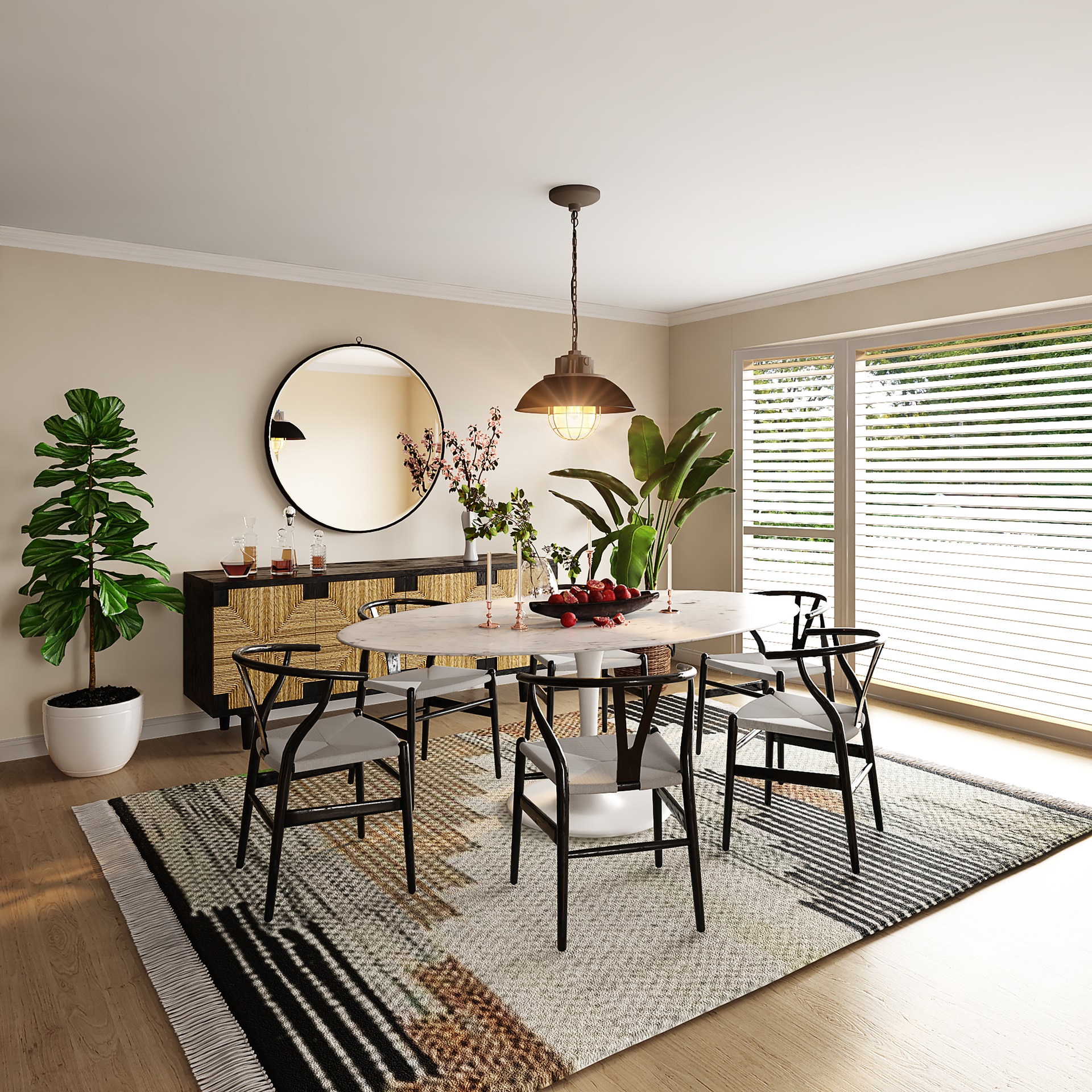
RULE: Choose a ceiling light half the width of your dining table. A 120cm wide (or diameter) dining table means a 60cm lamp.
The other way is based on the size of the dining room. You have to measure the length and width of the room in which you want to place your lamp, then add the two figures and multiply it by 3, multiply the result by 2.5 and you will obtain the appropriate diameter for your room.
An example:
We have a room that is 5 meters long by 3 meters wide. This is the operation we should do:
5 + 3 = 8
8 × 3 = 24
24 x 2.5=60cm
Having the correct scale light above your table will help the whole space feel more cohesive. Unless your lamp is a more abstract or sculptural piece, choose something that is on par with the size of the table; otherwise your room might feel overwhelmed by the lamp.
RULE: Center the pendant light on the table, not in the room.
You might think this is pretty obvious, but we’re including it just to be clear. If you have a junction box that is off-center from the dining room table, then move the chandelier or have the junction box moved so the light is directly on the table.
RULE: Hang your lamp so that the bottom is 70 – 90cm above the table. This way no one’s vision is blocked and everyone can see each other 🙂
You don’t want to feel like you’re in an interrogation room with the light directly overhead, and you also don’t want to lose all sense of atmosphere. So keeping the light at the right distance from the table will help both worlds work well together.
RULE: For rectangular chandeliers, leave at least 15cm from the edge of the table to the lamp on both sides.
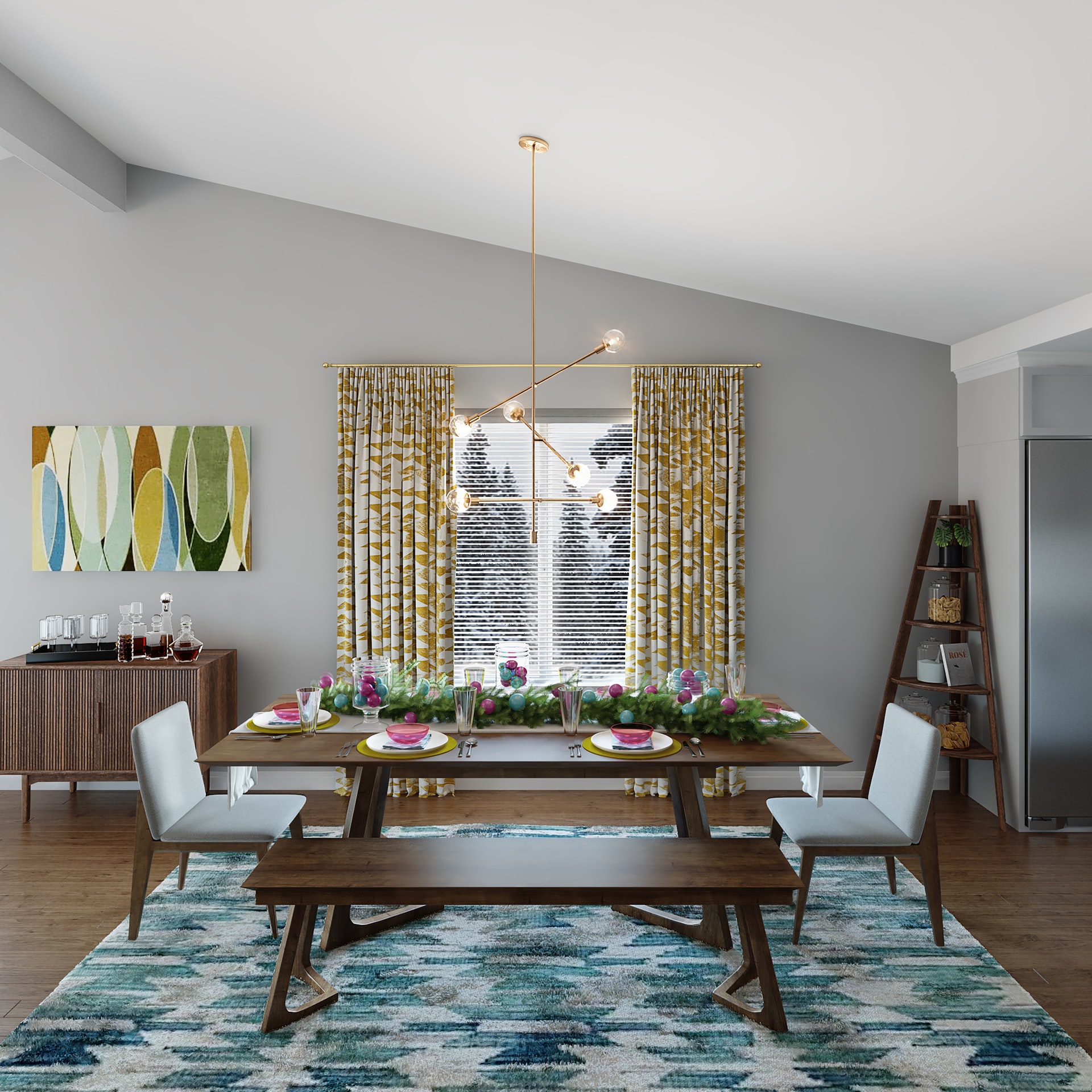
The lamp should not extend beyond the edge of the table in any direction. If it’s bigger than the table, the room might feel heavier.
RULE: For several pendants above a dining table, we recommend hanging them at a distance of 65cm – 70cm.
If you decide to place multiple pendants or a row of pendants on top of the table, this rule will help you space them out so they don’t sit too close and claustrophobic next to each other. It will also help the light spread evenly across the room rather than in one spot.
RULE: Place the wall sconces between 150cm and 180cm high from the ground. If multiple sconces are used in the dining room (or any room), ideally they should be 120cm apart, but at least 60cm – 90cm apart.
This rule isn’t just for aesthetics, it also helps keep the light bouncing around the room even so you don’t end up with any dark corners.
Sideboard
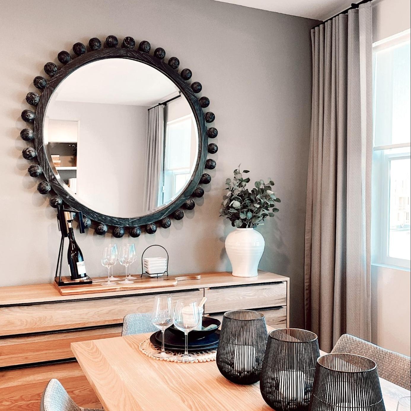
RULE: The sideboard should be at least as high as the dining table, but ideally higher.
When you walk into a room, your eye wants to see the surfaces that objects are displayed on, so having your sideboard slightly higher than the height of your table will help things feel proportionate and well placed.
Art
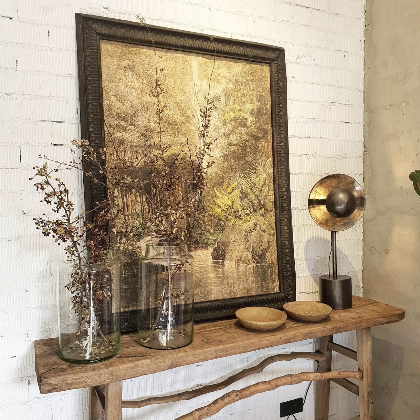
RULE: Art, whether a piece or gallery wall, must be at least 2/3 the size of the side of the table it is on, but typically no larger than the table.
This rule can be broken, but usually any type of wall art will look better if it is slightly narrower than the length of your table. If your collection extends beyond this, the proportions of the room can start to be thrown off.
On top of the Table
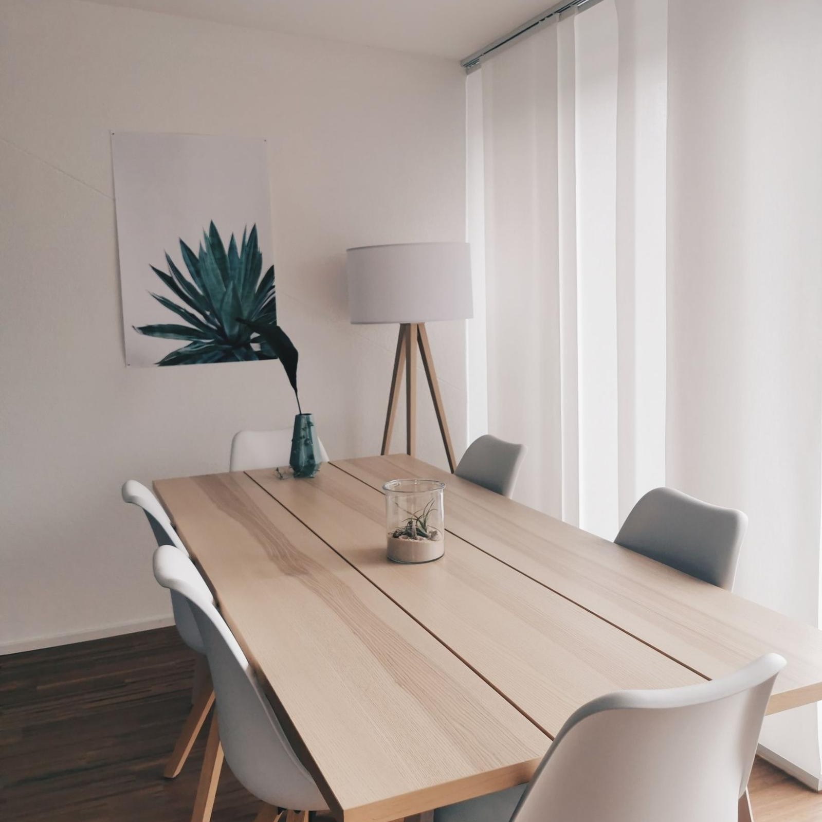
RULE: Keep centrepieces 12 inches or less so everyone can see each other across the table.
This is not a gala, save the wild centrepieces or flower arrangements for a party. When you’re sitting at the table, you don’t want to have to try to look around a centrepiece to see who’s in front of you. And last but not least, a design tip from Mike…
TIP: A personal rule of Mike’s is to never put a tablecloth on the table unless it’s on a more formal or party dinner. Instead, he uses a table mat for casual, everyday use if you need something on your table.
Bedroom Essentials to Create a Dream Space
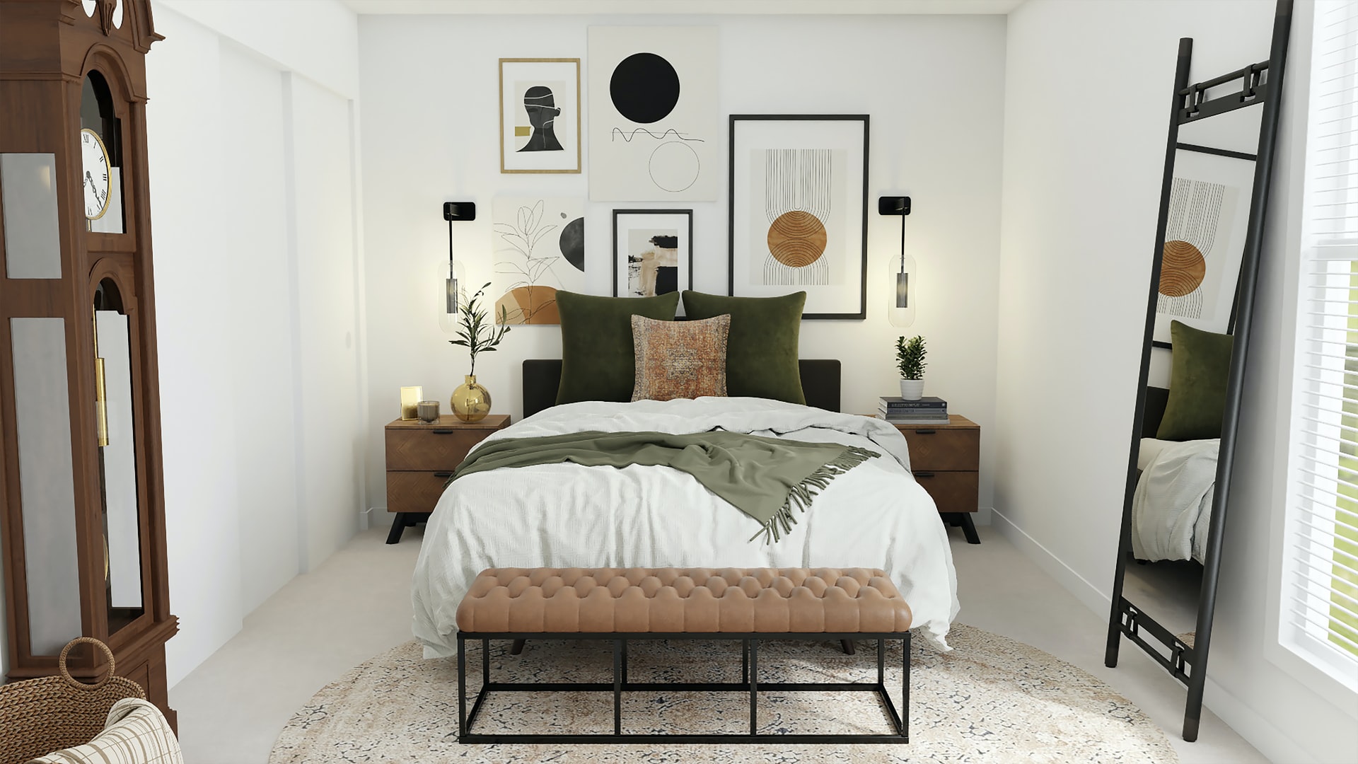
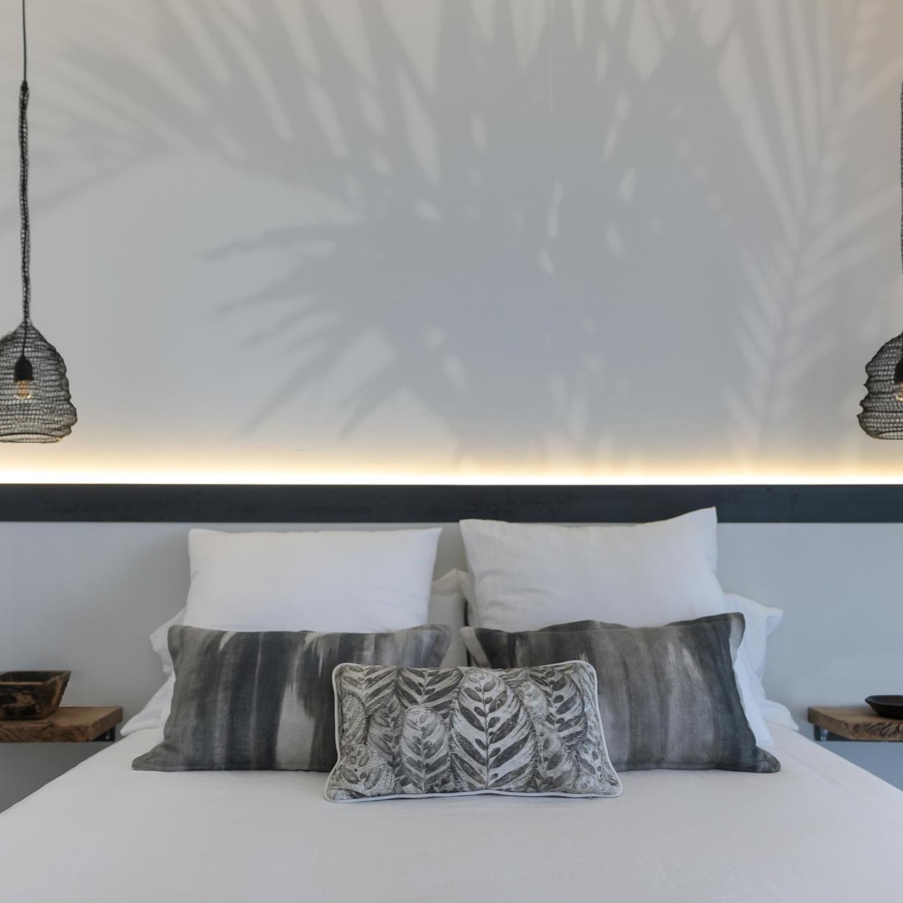
It’s no wonder that the kitchen and master bathroom are the most value-adding spaces in your home, and we won’t discuss that analysis, but on a personal level, nothing beats the bedroom. It’s possibly one of the most underrated spaces in any home, probably because guests rarely see it when they visit, but getting the design right here is key if you care about prioritizing rest, self-care rituals, and sleep. And after two years of the pandemic, that’s something we all want to perfect! So, in an attempt to help elevate your room from just a bed in a room to a sleep sanctuary, we’ve put together a list of essential bedroom tips.
Approach design as a work in progress
Design is an amalgamation of many things, and mistakes, to get it «right» is never as easy as it seems, so don’t force it. Take your time, add and take things along the way, be open to changing your mind and backing out if the direction you’ve taken is not what you envisioned.
It can be difficult to know where to start when designing a bedroom, and in reality you always have to take into account all the elements that will ultimately create harmony in the space. BUT, if you want an easy starting point, we suggest you start by creating an idea board. Let us help you put together some ideas, bed designs, materials, and colours. Soon you will begin to see clear themes: the same colours, styles and patterns and you can begin to visualize how you would like your room to be.
Plan the Best Distribution
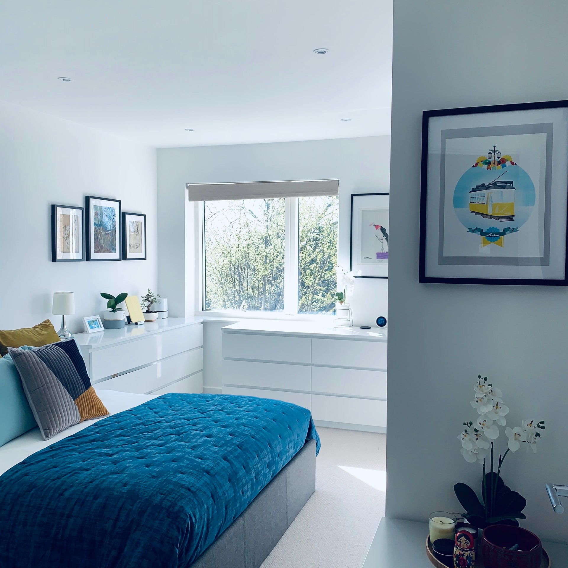
It is a space in which you are going to spend a lot of time and you need it to be in line with what you need. The choice of green is due to the fact that, despite the noise from the street (especially during Hogueras), green has an enveloping effect that brings you closer to nature.
Deciding on the distribution of the bedroom furniture is a fundamental step in its design. You may have little flexibility, but it’s worth drawing a layout on graph paper, paying attention to the direction from which natural light enters.
Start with the position of your bed, organizing the rest of the furniture around it. Placing the bed lengthwise is best in a rectangular room, while larger bedrooms will allow for more creativity, and you may want to place the bed in the centre of the room. When planning small bedroom layouts, consider moving the bed to a corner to save floor space.
Now consider the space (and budget) you have for bedroom storage. Built-ins tend to be more expensive and more formal looking, but offer a more efficient use of space, especially in a small or awkwardly shaped bedroom such as a loft. The unfurnished furniture doesn’t have to match, but you should at least have a dresser and a few nightstands. And if you don’t have a separate closet, you’ll need to add something to store your clothes.
Decorate with colours and textures
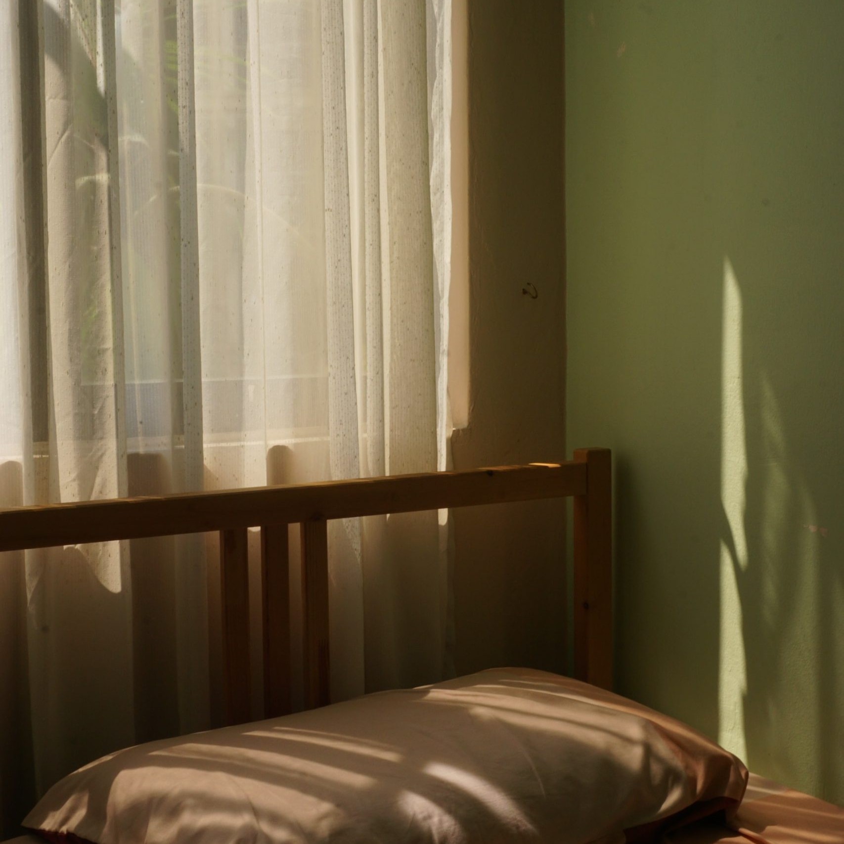
When approaching bedroom design, let colour and texture speak for you, designating places of calm and highlighting moments of ecstasy. Athena’s bedroom wraps you in serenity with its neutral palette, but she strategically placed a vibrant colour duo – the warm mustard hue of the chair and the burgundy red bench – to focus your attention and create that contrast we all crave. It is about creating an interesting dialogue between each piece so that, finally, the room sings in harmony.
An example is a project that we carried out in an apartment in the centre of Alicante. Initially, the client wanted to have plain white walls and ceilings. However, we had suggested a shade of green to be able to connect with nature in a busy environment. However, the client was firm and opted for white. We finally came back about three months later and painted the walls a pale green shade and also changed the crown moulding to be more in keeping with the new furniture we had purchased for them.
Be aware of the lighting (hint: it will be night)
Although natural light is important when designing a bedroom, most of us spend more time in our bedroom when it’s dark, so maximizing the bedroom’s artificial light potential with a smart lighting scheme is crucial to creating a cosy and relaxing space.
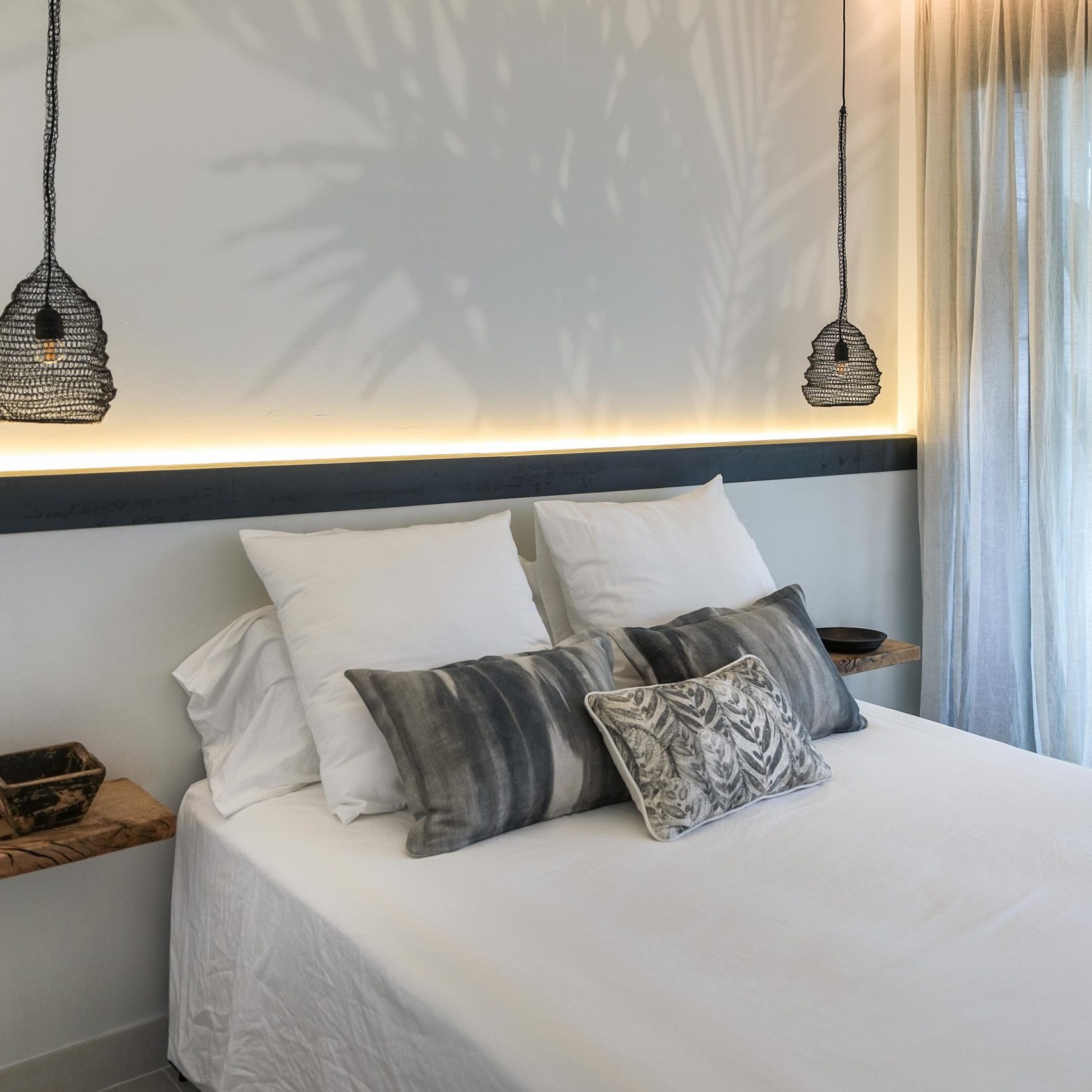
Think soft, diffused light from dimmable bedside lamps or wall sconces, or even a string of fairy lights arranged along the headboard. An overhead light may be unnecessary if you have built-in lighting in the closet and good task lighting around the vanity, for example, but in a room with a high ceiling, an oversized chandelier or lampshade will make a point. focal decorative.
Mix, match and select pieces that bring feeling
There’s beauty everywhere, so like the pergolero-birds, let your eye gravitate towards the pieces that make your heart burn, even if it’s not the latest trend! The bedroom is very personal, so it has to speak to you (and your partner).
In any bedroom design, large or small, a few finishing touches can make all the difference. The choice of bedroom accessories depends entirely on your tastes and your budget: invest in a quality rug and you will see your bedroom instantly look more elegant; add cushions and blankets to increase the comfort factor; create a gallery wall to add interest and color; display photos and paintings to personalize the bedroom, and use houseplants to promote a healthy environment.
Style your accessories to create an attractive colour scheme and variety of textures.
And, above all, follow these three tenants of global design
- breaks the symmetry by placing pieces of different heights in the room so that the eye does not stop
- mixes different types of surfaces to create tension between smooth and rough
- don’t be afraid to take risks and always trust your instincts.
Las mayores y mejores tendencias en decoración de interiores que pronosticamos
And so… our trend prediction post. So digging through our saved folders on Instagram and Pinterest, browsing portfolios of our designers and vendors, we managed to connect the dots of trends to see if there are any that might work in your projects. This year can be one of the most fun because of the variety of styles and the general playful nature. I think we all agree that this year we will have as much fun as we can. For the trends!
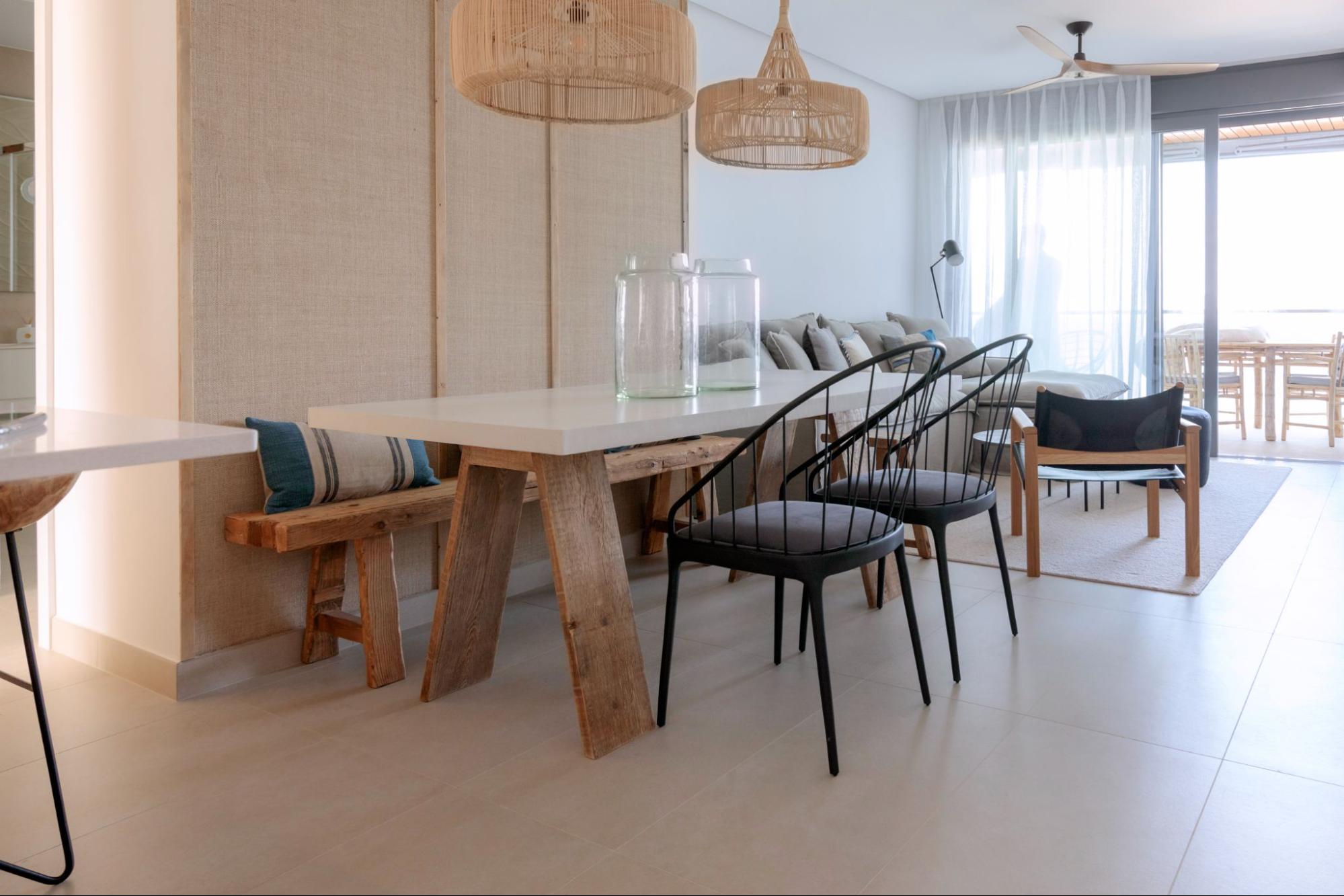
Colored Dining Tables
We all have many fun memories of sitting at the dinner table. You know, how to negotiate with our parents, how many green beans I had to eat before I could get up from the table (we often settle for three). But despite all the happy memories, having a colourful dining table wasn’t one of them and after seeing these photos I wish it had been.
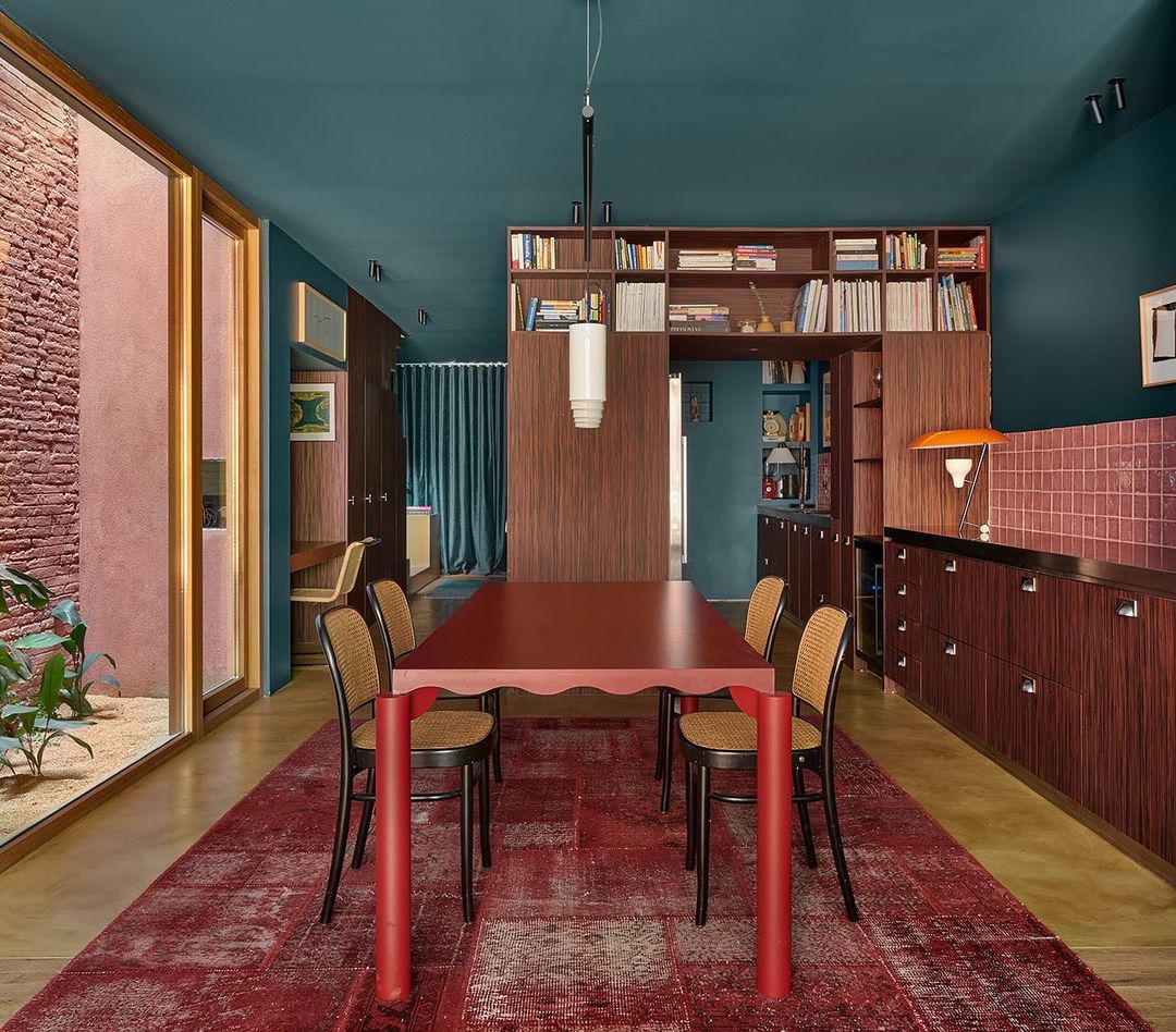
We have all seen poorly painted tables, but this is not that. This one is prettier (and higher quality). Adding a brightly colored dining table to an otherwise neutral dining room feels like a breath of fresh air. It says «I’m old, but I know how to have fun still». I think that should be everyone’s goal… unless you have zero intention of wanting to have (boring) fun.
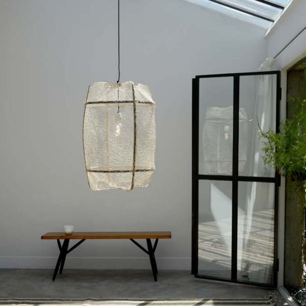
Extra Long Ceiling Lamps
There is nothing we love more than a beautiful, chic and relatively impractical design option/trend. Welcome to the «Extra Long Ceiling Lamps» part of this design program. When we first saw these lights upstairs, we immediately said to ourselves, «How can I get one?!» Those might be able to be adjusted so they stand up for when people are on top.
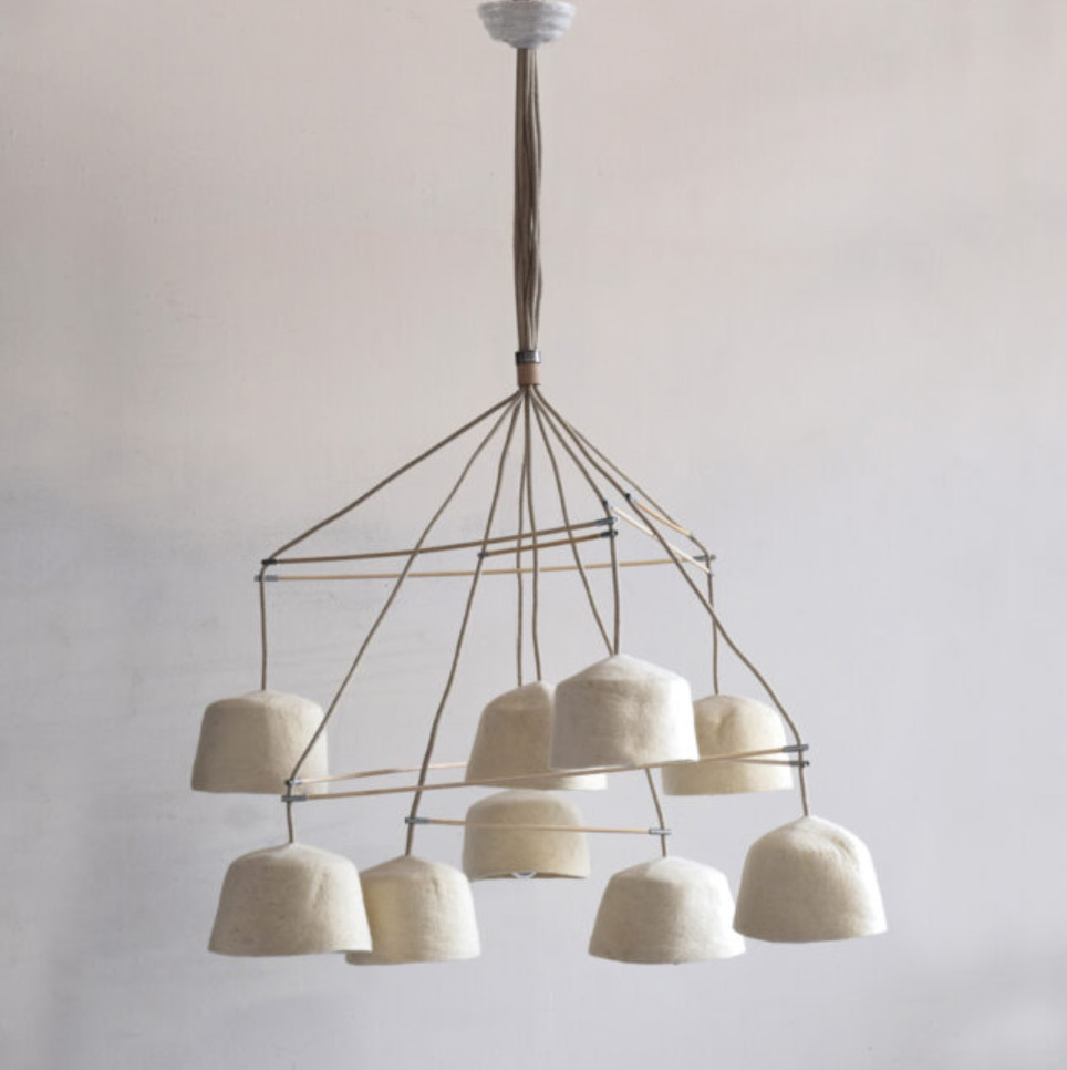
We see this often, right? Designers take normal decor pieces and play with proportions. We think it’s a lot of fun because reinventing the wheel is so hard to do. So if you come to our studio and trip over a ceiling lamp, I’m sorry in advance 🙂
Mushrooms
Mushrooms aren’t just for babies and Gen Z (although they love them, too). We have loved mushroom motifs in design for a long time. They add whimsy and are super fun. That’s obvious when you look at the room above. Somehow this stool is both elegant and playful. The dream.
Gen Z, in general, is sweeping the category of quirks and games. So decorating with mushrooms makes a LOT of sense. I guess we’ll see if they eventually trade them for more neutral options in the future.
Wrought Iron Elegance
Esta nos toca de cerca porque nos hemos enamorado mucho de esta tendencia. De todos modos, mientras que la tendencia es todas las cosas de hierro forjado (pero simple y más en el lado orgánico). Mira esta belleza de abajo.
This touches us closely because we have fallen in love with this trend. Anyway, while the trend is all things wrought iron (but simple and more on the organic side). Look at these beauties above.
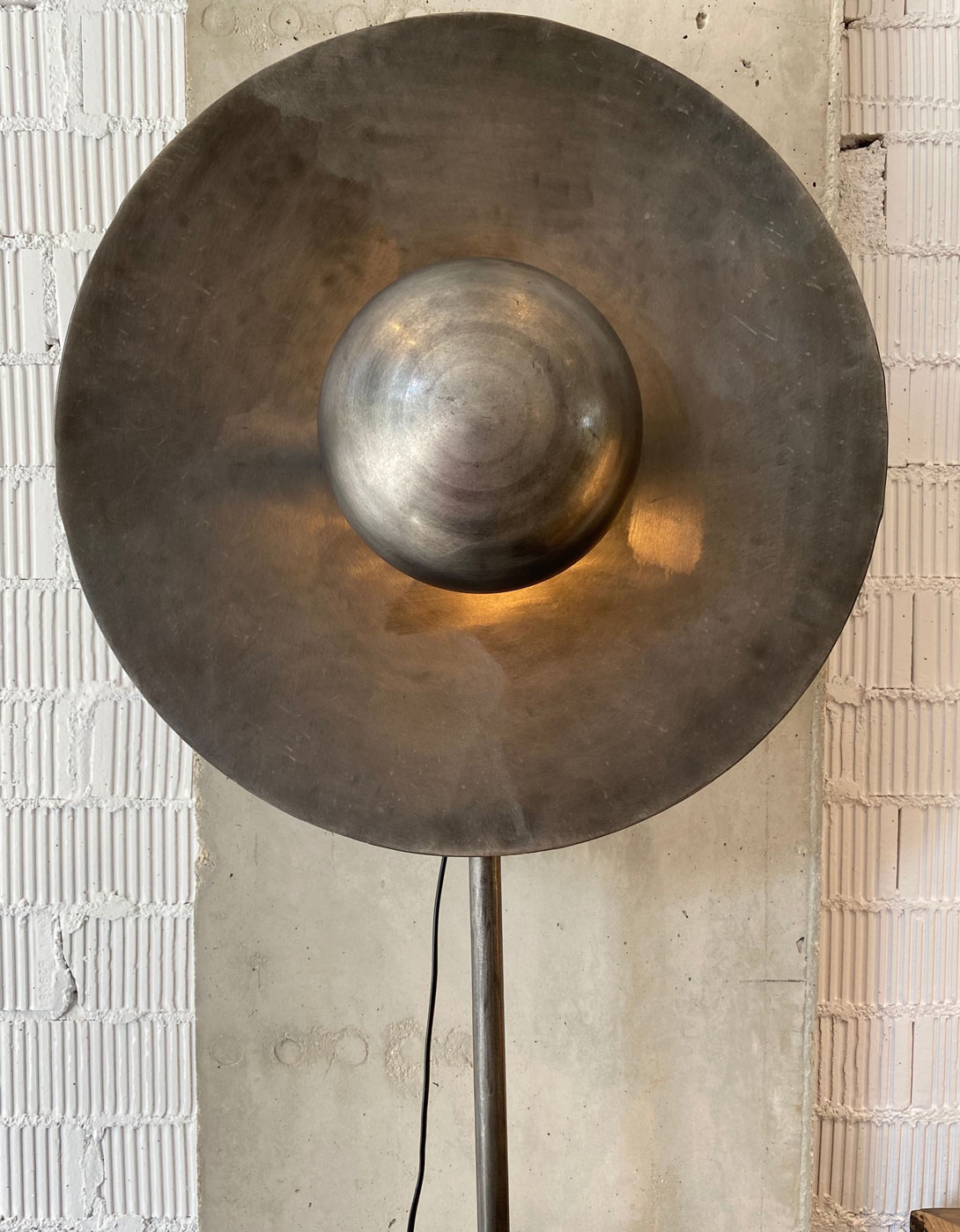
This is not your parent’s decorative wrought iron sculpture (sorry mom and dad). This is the traditional, yet a special sculptural moment that really makes a statement. Think how impressive that tall candle holder would look.
High-end designers have embraced this trend.
As for the furniture, the «iron wave» is very fashionable. Everyone from Athena Calderone to Nate and Jeremiah (no last names needed) to Nicholas Obeid and Tali Roth, to name just a few. So the next time you’re out vintage shopping, keep your eyes peeled.
Medium Tone Wood (and Reddish)
After years of light Scandinavian woods, we are delighted that there is a shift towards not only darker woods but even more reddish tones. I think like everything there is a point of saturation and while white oak and the like fit very well in certain homes, this change expands the options and allows for deeper tones in the home if desired.

While the retro mid-century look is having a moment, we’re seeing a return of more orange teak like the table above. It has a bold warmth that can help offset light tones (like the ground). And there is a rebellion that says «I’m still in the middle of the century», which we support.
We love all good quality wood (we prefer the less shiny), so it’s nice to see more reds and warm tones gracing our internets.
Although the years of white oak and ash aren’t over, we’re excited to see more wood grain joining the table (wink).
Mini Wall Shelves
This is a case of the power of repetition. Is it a gallery wall or an art installation? Either way, it elevates or gives a lot of attention to the object it’s holding and we like this intentional eye catcher. It adds so much more dimension than a gallery wall, but still with a looseness that allows for creative freedom.
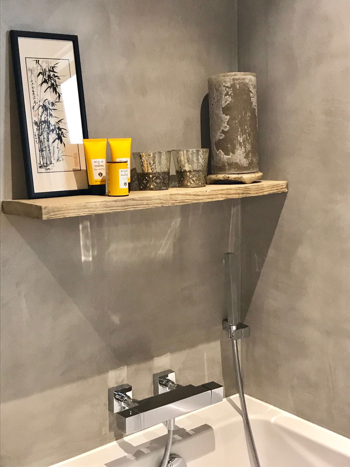
There’s something really simple, yet powerful, about putting the same object on the same shelf over and over again, or the hell of strange objects on different shelves. I guess the audacity to punch through walls so many times makes us uncomfortable in a really good way. Respect.
Properties in Muchamiel

Look at the properties we manage with our partner IMMOABROAD
Inland tranquillity and tradition with space to breathe
There is plenty of space to develop your own home, enjoy one of the developments or live in a real Spanish village.
Muchamiel (or Mutxamiel) is a coastal town located north of Alicante that offers a unique combination of peace, comfort and entertainment. With a population of 25,000 residents, Muchamiel is a small and welcoming place that has managed to preserve its traditional charm, despite the growing tourism in the region.
One of the main attractions of Muchamiel is its warm and sunny climate, perfect for outdoor activities throughout the year. Residents can choose between living in the town center, in one of the nearby developments or building their own house on one of the available plots.
For golf enthusiasts, Muchamiel is an ideal starting point, as it is located close to the Bonalba golf club. In addition, hiking and cycling fans can enjoy the nearby mountains and explore the beautiful natural landscapes of the region.
When it comes to gastronomy, Muchamiel offers a wide variety of options, from local bars and restaurants serving traditional regional dishes to international restaurants offering a wide range of culinary options.
Some of its places of interest are:
Bonalba Golf Club: This is one of the most popular tourist spots in Muchamiel, it is an 18-hole golf course with stunning views of the nearby mountains. It offers a tranquil and relaxed environment for golfers, as well as a wide range of services and amenities, including a restaurant, bar and pro-shop.
Sierra de Aitana Natural Park: This natural park is one of the most important in the region and is a popular destination for nature lovers. It offers a wide variety of hiking and cycling trails, as well as a number of stunning natural landscapes, including panoramic views of the mountains and the sea.
Muchamiel Castle: This impressive castle is one of the region’s most important historical buildings and offers a unique glimpse into local architecture and history. It can be visited and explored on the inside, as well as its surroundings, including a garden and a square with a fountain.
Town Hall Square: This is the heart of the town of Muchamiel and is an ideal place to relax and enjoy a coffee or outdoor meal. It is also a popular location for events and cultural activities taking place in the town.
Municipal Market: This market is an ideal place to try local products and cuisine. It offers a wide variety of fresh products, including fruits, vegetables, meats, fish and cheeses. It is also a popular place for residents and tourists to buy souvenirs and local items.
Local Wineries: Muchamiel is known for its high-quality wine production and offers a number of wineries that can be visited and tasted. Here, you can learn about the history and production process of wine, as well as try some of the region’s most famous wines.
Muchamiel Caves: The Muchamiel caves are an impressive natural attraction and a unique experience for visitors. They can be visited and explored on the inside, including stalactites, stalagmites and a wide variety of unique geological formations.
Vintage Festival: This festival is held annually in September and is a celebration of wine harvest and local culture. It includes a number of activities, including processions, live music, food and drink, and a parade of decorated floats.
Botanical Gardens: Muchamiel has a number of botanical gardens that offer a wide variety of exotic flowers and plants, as well as a quiet and relaxed environment for strolling and enjoying nature.
Equestrian Center: This equestrian center offers a wide variety of activities for horse lovers, including horseback rides, riding classes and equestrian competitions. It is also a popular place for children and adults to learn about horses and enjoy their company.
Overall, living in Muchamiel is an excellent option for those seeking a quiet and relaxed life, away from the coast’s bustle, but with all the necessary amenities and entertainment within reach. With its warm climate, diverse cuisine, and natural and sports attractions, Muchamiel is an ideal place to live, work and enjoy.
All of our experience available for you
In Sublime, we combine our real estate consultancy alongside our interior design services. Both complement one another so that you can enjoy your ideal home.
Discover the properties that we currently have in our portfolio. If you can't find what you are looking for, then please contact us and we will help you.
Get inspired by one of our latest projects. Renovating your home will be a pleasant and pleasing process if you use the extensive know-how of our interior design team.
Properties in Gran Alacant

Look at the properties we manage with our partner IMMOABROAD
Modern facilities close to a natural paradise
Gran Alacant is a zone to the south of the city of Alicante on the coast just north of Santa Pola.
Gran Alacant is a coastal area located in the province of Alicante, in the Valencian Community, Spain. With its urban development that began in the 80s and its growth in 2000, it has become a popular destination for tourists and Spaniards who are looking for a place to live or spend their holidays.
The area has a wide variety of modern housing, from chalets to apartments, all equipped with the necessary services for a comfortable stay. In addition, Gran Alacant has a significant permanent resident community, which means that the area is active and offers a wide range of entertainment options throughout the year.
One of the main attractions of Gran Alacant are its beaches. With magnificent and white sand protected from construction, it is easy to understand why the area is a popular destination for sun and sea lovers. In addition, near the developments there is a nature reserve, ideal for walking, sports or simply enjoying nature.
In terms of cuisine, Gran Alacant has a wide range of options, from local restaurants to bars and beach bars. Here you can enjoy the best Mediterranean cuisine, with typical dishes such as paellas, rice dishes and fresh fish.
The climate of Gran Alacant is warm and sunny, with hot summers and mild winters, making it perfect for those who are looking for a warm and pleasant climate all year round.
In conclusion, living in Gran Alacant is a great option for those who want to enjoy nature, sun and sea, along with the services and comfort of a modern and well-equipped area. With its dream beaches, its wide range of entertainment options and its warm and sunny climate, it is easy to see why Gran Alacant is such a popular destination for living or spending your holidays.
All of our experience available for you
In Sublime, we combine our real estate consultancy alongside our interior design services. Both complement one another so that you can enjoy your ideal home.
Discover the properties that we currently have in our portfolio. If you can't find what you are looking for, then please contact us and we will help you.
Get inspired by one of our latest projects. Renovating your home will be a pleasant and pleasing process if you use the extensive know-how of our interior design team.

