I think it’s safe to say that we’ve all been looking at our furniture a little more these days. Strange coincidence, I know. But if you’re ready and want to shake things up in your space that requires the least lift on a zero budget then this post might give you the inspiration to do so. The number one design dilemma we’ve been asked by many of our clients is, «Help, how do I lay out my room?»
Now, what if I told you that ALL questions have a common denominator? We realized that it wasn’t so much the arrangement of the furniture in the space as there was too much or too little in the right scale. Shocking and true. However, the good news is that it is a fairly easy fix. This is how our new “Design Mistake: Too Much Furniture” was born.
So you’re looking at your room again, and now you think this might be your problem too? Well, today we are going to give you all the tips and tricks you need to FIX/avoid this from happening to you with the help of salon agonies from our real readers. So we will all learn together.
Join me as we dive into the mistakes below… but first, let’s take a moment to look at someone else’s furniture. Ahhhh thank you, that was relaxing.

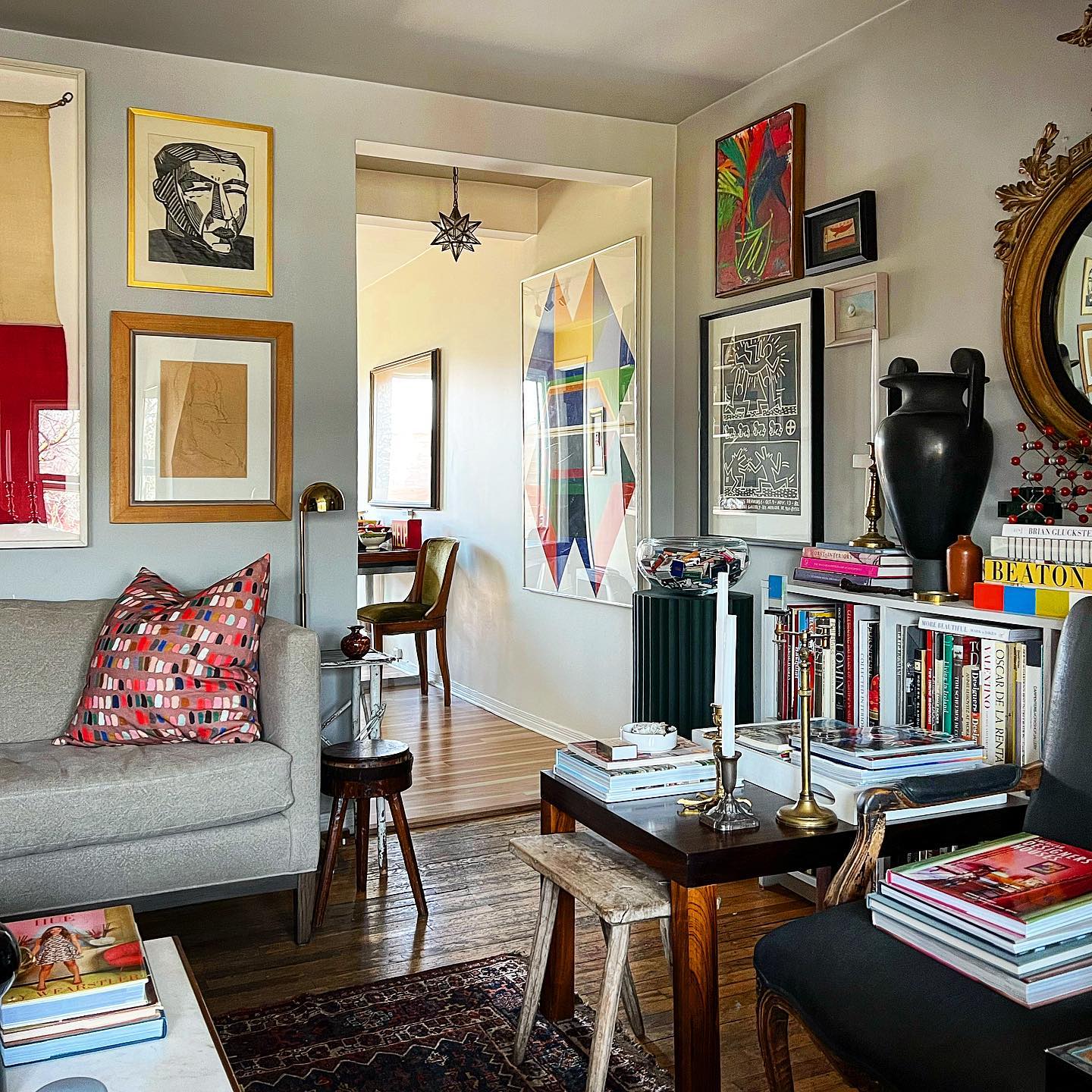
Why it doesn’t work: When there are at least 6 chairs/sofas, 4 tables, and 1 sofa in a room it may be time to remove some to make that big space feel really spacious. The solution could be as simple as removing the armchair (with books on it) and the side table (which is too high). That’s it, that’s better. Though I think having all the matching pieces in a similar colour palette helps the space not feel too overwhelming, unlike the space below.

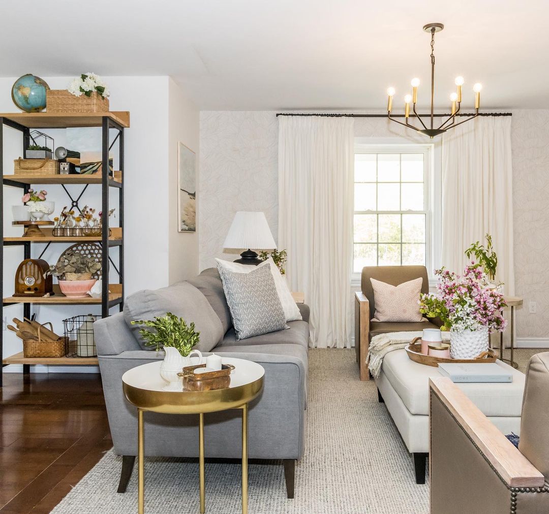
Why it doesn’t work: This is a slightly different problem. Here the furniture is simply too close together. There is not enough space between the sofa and the central upholstered bench in the centre. The same goes for armchairs. The distance between the armrests (sharp-looking) of the armchairs and the sofa is also not enough to pass comfortably. By the way, having solid arms in the armchairs also takes away the feeling of space that the room could have.
We are not going to mention the more than fifty pieces on the shelf.

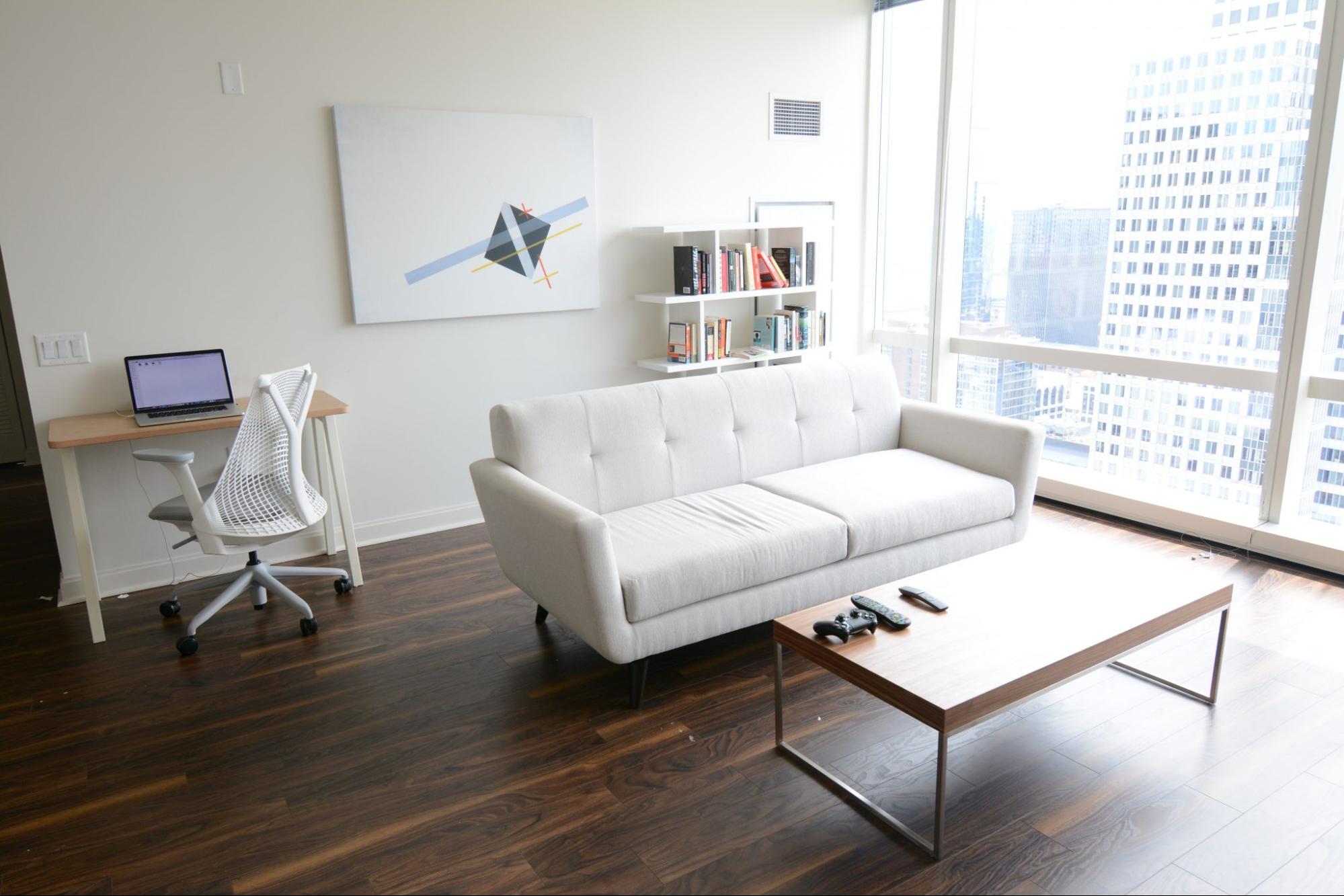
Why it doesn’t work: We’re not telling you to be a crazy «minimalist» like in the house above, either. You don’t want your house to feel empty and sad. The upstairs space lacks that homey feel because it lacks texture, warmth, and, you know, a side table.
Some Rules
So how do we find the balance between having to squeeze our bodies between two chairs, a table, and a sofa or being able to do a “Front Handstand, Round Back Handstand, Round Back Handstand, Full Twist?” » without hitting a single piece of furniture? That’s next…
In case you need a refresher, here are a few to get you started:
Leave 75cm to 100cm of space between large pieces of furniture (if your living room allows it), if not, at least 45cm – 60cm.
Make sure there is no less than 1m and no more than 3m of space between the seats.
If possible, sofas should never be flush with the wall. Pull it out 7cm – 10cm and give it some room to breathe.
Your coffee table should be at least half the length of your sofa and no more than 8cm taller or shorter than the top of the sofa seat cushions.
The ideal distance between the sofa and the coffee table is 40cm to 45cm.
The rug should be large enough so that at least the front legs of the sofa and all the chairs rest on it.
Side tables should be no deeper than the depth of the sofa and keep the end table close enough to set down a drink with ease. Which is usually 5cm – 7cm from the height of the arm.
Accent chairs should have around 100cm (size of your arranged room) between a set of living room accent chairs to be able to fit a small table in the middle. For a smaller room, simply place the chairs side by side.
When pairing a sofa and accent chairs, choose seat heights that are less than 4″ apart.
Make sure the console is the same height or a few inches shorter than the back of the sofa. In addition, the ideal is that it has about 15cm of space at each end.
The distance between the TV and the sofa should be about 18cm and an optimal height for the centre of the screen is 75cm above the lowest seat height in the room.
Do you have all that? I know, it’s a lot of information and this is just the living room. Sometimes interior design can be overwhelming, so we love to help out when we can. I love working on these mini-projects and getting to know you better, it’s a really fun part of my job.
Main Image: ellealyss
